Digital Humanities Tools for Beginners and Non-coders

Dear beginners to Digital Humanities and non-coder academics,

I have some good news for you: you can begin your digital humanities project and explore different tools before you learn to code or not learn to code at all. As scholars, we continue to learn and decide which digital skills are best suited for our research and projects. We may learn a skill and later decide our efforts are best spent honing a different digital skill or methodology. The most common coding languages we, the GCDFs, use and teach are R and Python. But, until you decide to learn either, both, or another coding language, there are tools you can use to execute your digital research and projects. 

A tool that many of us have encountered and that we might not necessarily think of as a DH tool is a spreadsheet softwares in which data is arranged in rows and columns and can be used to make calculations or re-organized to reveal patterns. Spreadsheets are a great tool to store, organize, clean, analyze, and even create simple visuals of data points. They are a helpful beginner tool that can assist you in deciding if you need to use more dynamic systems like databases or write code to perform more complex analysis and synthesis of your data. 

A tool that utilizes the simple spreadsheet software is Knight Labs Timeline. TimelineJS is an open- source tool that allows you to visualize your data into an interactive timeline to include text, maps, images, and audio! An example of a project that uses Kinght Labs’ Timeline is Jenna Queenan’s 20 Years of History: New York Collective of Radical Educators

Another way spreadsheets can be used is to analyze text. Both Google Sheets and Microsoft Excel feature “Analysis Content” add-ons to allow users to conduct sentiment analysis or topic detection. However, what if you have a machine readable text and you want to use it as a corpus to conduct a text analysis? (A machine readable text: an image, handwritten, or printed text encoded into a digital data format to be machine recognizable. Think of a document where you can highlight individual characters as opposed to a document where you are unable to highlight a single character and the entirety of the document is highlighted because the machine recognizes it as one large character. Or think of those scholarly articles that can be read to you by your text-to -speech application. Both being able to highlight individual characters in a document and having the document read to you indicates that the text is machine readable.) So, if you have a text formatted in plain text, HTML, XML, PDF, RTF, or MS Word, even if it is in a Language Other than English, you can use an open-source tool called Voyant-Tools to upload your corpus or corpora and conduct the text analysis. Voyant-Tools can also assist in widely-reading (or distant reading) a text or formulating research questions

The benefit of both TimelineJS and Voyant-Tools is that they allow you to either simply use them as is or expand the scope of your project further you become a coder. These tools are examples of open-source, web based, non-coder tools that allow for both beginner DHers and non-coders to gain access to DH strategies and methodologies while avoiding the cost of non-coder proprietary tools. For more DH tool options, both for advanced users and beginners, check out University of Toronto’s Find Digital Scholarship Tools website. 

For more on DH methodologies and applications, go to our blog and check out our catalog of  events

Best wishes, 

Your fellow (learning to code) DHer.

students working on laptops at same table

Call for Proposals: Provost’s Digital Innovation Grants 2019-2020

Applications for Provost’s Digital Innovation Grants – also known as PDIGs – are open! If you’re working on a digital project, planning to, or hoping to attend a short course or workshop to learn a skill that may support a current or future digital project, then this grant opportunity is for you!

PDIGs are broken out into 3 tiers – Training, Start-up, and Implementation grants – all of what are during by 5:00 PM on Friday, October 18, 2019

Learn more about this Call for Proposals: Provost’s Digital Innovation Grants 2019-2020 and review past projects on our digital grant website.

Using Omeka

Omeka is an open-source publishing platform used for libraries, archives, and museums. It can be used to showcase digital collections: cultural heritage and online exhibitions. It can also be used to build a community photograph collection like The Bushwick Archive. I teach the free version in and out of academia and emphasize the importance of being in control of what we want to curate.  As such, 3 Omeka tools share similar names, serving different intended audiences. You can start your digital curation journey with Omeka.

It is a great platform for broadening your audience.

Different versions of Omeka:

  • Omeka S is intended for institutions with multiple sites/projects, and requires a server for self-hosting.
  • Omeka Classic is intended for a single site/project, and requires a server for self-hosting
  • Omeka.net is intended for a single site/project, and is a hosted service by Omeka

I personally use Omeka as an example of a pedagogical tool that can help people in and out of the classroom. 

Different ways to use Omeka:

  • Share digital objects with the public
  • Collect digital objects from a community
  • Create a collaborative class digital archive

The Bushwick Archives:

The way I use Omeka for my community archive project, The Bushwick Archives

The Bushwick Archive is a community-led bilingual digital archive that collects, preserves, and honors the stories of poor and working-class people of color in our neighborhood. Centering the archive as curriculum, we prioritize process and elucidate the importance of who is doing the archiving and preserving. 

Using Omeka:

For the GCDI workshop I facilitated in Spring 2026, Introduction to Omeka, I focused on the free Omeka.net plan. 

This has 500 MB of storage space.

I emphasized how Educators can build inquiry-based tasks for students, create lesson plans with an archive of primary sources, or build learning modules with your team.

And how students can create a digital essay that draws on an annotated collection of primary sources. 

Like I suggested in my workshop, if you are having some trouble thinking through what to create on Omeka, consider this exercise. 

  • Write a 2-3 sentence introduction to your topic
  • Write a brief overview of your collection of items. (About two paragraphs is fine). 

Sign up for an Omeka account: 

  • Be sure to click the free version!
  • Click “Start your free Omeka trial” and fill out the form to create your site.

Important things to know:

  • Metadata = information about an object. It is the information that describes an object or other piece of data
  • Items are organized through Dublin Core

I currently teach workshops outside of academia so that people in general have access to a free digital platform that they can use to curate their own vision and ideas. Overall, Omeka bridges the gap between archival databases and creating an engaging website that does not require any prior technical skills!

As the summer approaches, it is the perfect time to experiment with a personal project or think about how you can use Omeka for the upcoming Fall semester.

The first big step is creating a free account!! Feel free to contact GCDI for a consultation on Omeka and look out for future workshops.

Let’s Archive It! Event Recap

In April, the Digital Fellows were delighted to host the event “Let’s Archive It,” which brought together three archivists from across the CUNY system to discuss the exciting archival work that is happening here at the Graduate Center and across the CUNYverse. The goal of this event was to share the innovative and impactful work happening at CUNY to the GC community of students and scholars across disciplinary divides. The event kicked off with Jessica Webster, Head of Archives and Special Collections at Baruch College as well as a PhD student in history at the GC. She opened the afternoon’s conversation with a quote from archival studies scholar Michelle Caswell:

“The archive” has been deconstructed, decolonized, and queered by scholars in fields as wide-ranging as English, anthropology, cultural studies, and gender and ethnic studies. Yet almost none of the humanistic inquiry at “the archival turn” (even that which addresses “actually existing archives”) has acknowledged the intellectual contribution of archival studies as a field of theory and praxis in its own right… In essence, humanities scholarship is suffering from a failure of interdisciplinarity when it comes to archives.”

Jessica continued on to outline the lifecycle of work in archives, from acquiring new materials, to describing and making materials accessible, through preservation considerations. In addition to the substantial work and care that goes into this process, Jessica highlighted the role of subjectivity and power, and thus the constructed nature of the archival record.

Natalie Milbrodt, the inaugural University Archivist for the City University of New York (CUNY), shared initial findings from Cultivating Archives & Institutional Memory, an ambitious project to unify practice at CUNY’s 31 libraries and 100 cultural centers and institutes. The three-year, grant funded project has seen a team of over a dozen archivists work across the CUNY system to survey archival holdings at each campus. The team opened every single box (over 50,000!) and recorded information about content, unique formats, or any condition concerns. The team also surveyed digital materials, identifying over a Petabyte (1,000TB) of material. The team also works to foster appreciation of CUNY’s incredible archival collections: creating a research guide on the Red Scare at CUNY and hosting an accompanying event, contributing to scholarly publications, creating a Faculty Fellowship, and more.

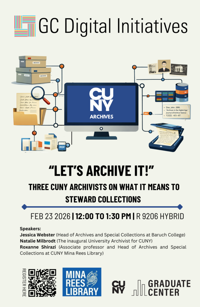
The final presenter was Roxanne Shirazi is associate professor and Head of Archives and Special Collections at the GC’s Mina Rees Library. Roxanne focussed her presentation on the CUNY Digital History Archive, and methods for activating CUNY history in CUNY classrooms. Roxanne outlined how, unlike the archival survey project discussed by Natalie, the CUNY Digital History Archive (CDHA) is a counter-institutional archive which centers the CUNY community to foreground an experiential, narrative-driven, and contextual approach to exploring CUNY’s history. It is also a digital, post-custodial archive in which materials are digitized and then returned to their owners, and prioritizes the participation of students, alumni, faculty and staff. Roxanne also discussed recent efforts to bring CUNY’s activist histories into undergraduate classrooms by building community around teaching with primary sources from CUNY archives, including creating short-term fellowships for GC doctoral students, designing open educational resources, hosting pedagogy workshops, and more.

Attended by approximately fifty people, in-person and online, the event bridged disciplinary boundaries to share the foundations and possibilities of archival practice and engagement at CUNY.

Scrabble blocks with the word DATA spelled out.

Update from the Digital Scholarship Lab: Visit our Data Lab

Every spring semester, the digital fellows discuss their observations and findings from the fall semester about the Graduate Center’s students, faculty, and staff needs regarding technical skills, digital tools, or digital scholarship. The question we ask each other is, aside from the drop-in hours, workshops, consultations, user groups, and blog posts, how can we respond to the GC community’s immediate need(s)? Last year, the digital fellows held the Conversations in Digital Scholarship: a gathering of GC digital humanists and scholars to work through ideas and projects on five topics in round table discussions that culminated in a whole group reflection session.

This semester, the digital fellows found that many scholars, ourselves included, needed a space to workshop our digital projects and the work we do with data. After some considerations, we opened the Data Lab: an informal and interdisciplinary space to discuss all things data. On Friday, March 6th, we held Data Lab: Wrangle Your Date and on Thursday April 30th, we held Data Lab: Visualizations. Below, I mention some of the resources I found especially helpful for beginners and pedagogues. resources to get you started on your data journey or to use in your classrooms. 

Data Lab: Wrangle Your Data

Digital scholarship begins with data. We observe something, ask a question about it, and then collect information to answer that question. The data we collect can range from the total number of complaints made to NYC 311 about city potholes to transcripts of interviews for an oral history project. Whether numerical or alphabetic, we need to collect, clean, sort, read, and analyze our data. We have the option to produce our own data or to retrieve accessible public data. Open public data sets are also helpful to use to practice cleaning, sorting, and analyzing data for scholarship or for pedagogical purposes. A few public data sources I find helpful are: NYC Open Data, Data is Plural, and, one of my favorites to use for text analysis, Project Gutenberg. Once you have found the data that responds to your query or learning objective, you will need to clean, sort, and manipulate it to narrate your research. One powerful method of data storytelling is data visualization.

Data Lab: Visualizations

Who is your audience? This was the question at the beginning of our Visualizations session. Your audience and purpose determine your story and thus determine the type of visualization you use to narrate that story. A helpful resource for novice data visualizers and pedagogues is Data Viz Project. This project is a catalogue of visualization types. For each type, you can explore  the visualization’s function, structure, and input requirements (i.e, how data should be organized). For example, if you want to compare data points, you can use the Sunburst Diagram. But, how do you know to use this diagram? You can either filter what you need from the homepage or you can select a visualization type and explore it further. On the visualization type page, you will find information about its design, purpose, family ( chart, diagram, graph etc.), function, shape, and input. For example, if I select the Sunburst Diagram, I quickly learn that it “illustrates hierarchical data in a radial layout” and functions to compare information. ( As a writing instructor, I wish there is a genre catalogue similar to this to assist students when they approach writing projects.)

Text about the defintion of sunburst diagram wth an image

The Data Viz Project catalogue helps you select the function (or the way you want to tell your story) and organize your data for the desired purpose (e.g. present your findings to an interdisciplinary dissertation committee or show the use of gendered language in LLMs to undergraduate students). Like any good story, data must be structured to create a vivid and lasting image in the reader’s mind. Data visualizations are like the metaphors that capture the audience’s attention and reveal the deeper meanings and connections of a research project. 

As we continue to tell our stories and guide our students to tell theirs, I encourage you to visit our Data Literacies curriculum on DHRIFT and to learn from Data Visualizations experts at the Open Visualization Academy.  Of course, remember to subscribe to our calendar for upcoming Data Lab sessions and come explore data cleaning, sorting, ethics, management, and more!

Data Lab: Visualizations

Do you find yourself in the process of finding the most “efficient” way of visualizing your data? Questioning whether your visualization fits the story you want to tell? Unsure whether to code from scratch or use software? Juggling options for visualization style, mode of interactivity, and design choices? Bring all your questions and join the GC Digital Fellows for an informal but productive discussion about all things data. We will touch on topics like various tools you can use to create visualizations, challenges to visualizing data, how to reach your audience, alt text, labeling, captions, effective titles, and more. The Data Lab is an open, interdisciplinary space designed to help you think through challenges that you may be facing or to share your triumphs. In an open discussion format, we will share some of our tips and tricks for visualizing our data, and we welcome all cross-disciplinary insights. Come for the learning: stay for the catharsis!
For this in person event, you can just drop by or register in advance at https://cuny.is/datalab
A dramatic conceptual image of a businessman viewed from behind, holding his head in his hands in a gesture of stress. He is standing in front of a large, semi-transparent digital overlay of a stock market dashboard. The overlay features a glowing orange and yellow candlestick chart showing a sharp downward trend, several fluctuating white line graphs, a world map, and percentage markers. The background shows a blurred office or trading floor environment.

Breaking Tableau Out of the Boardroom

If you’ve ever loaded a research dataset into Tableau, you’ve probably been a bit intimidated. The interface templates are set up to analyze things like “Regional Sales” or “Shipping Costs,” leaving those of us researchers with census tracts or survey data feeling like we’ve picked the wrong tool for the job. 

But with a little massaging, Tableau can be great for visualizing datasets for academic research—provided you stop using it the way an MBA would. The trick is knowing which business features to ignore and which research-specific workflows to lean into.

Here are some tips to breaking into the Tableau biz:

1. Embrace Long Data

Academic datasets often come in a “wide” format, where each subject has a single row followed by dozens of columns for different variables or time points. Tableau, however, functions best with long data. If you keep your data wide, you’ll be forced to manually drag every individual variable onto your workspace, which is tedious and limits your analysis.

To fix this, go to the Data Source tab, select your variable columns, and click Pivot. This transforms your data by collapsing those many columns into just two: one for the Variable Name and one for the Result. This single step allows you to use a simple filter to toggle through every data point in your study, making your workbook much easier to manage and scale.

A conceptual diagram comparing "Wide Data Format" and "Tall (Long) Data Format" using student test scores. On the left, a green-header table shows "Wide Format" where each Student_ID has one row with columns for Math, English, and Science scores. On the right, a blue-header table shows "Tall Format" where each score is a separate row, resulting in three rows per Student_ID: one for each subject. Arrows or positioning imply a transformation (pivoting) between the two structures.

2. Find the Tools for Distribution

In a corporate dashboard, “Total” or “Average” is usually enough. The default visualization options in Tableau usually work in these terms. But in research, the average is often just the beginning of the story! 

Switch your default visualization from bar charts to something like Box-and-Whisker Plots. Box-and-Whisker Plots give you an immediate look at the spread of your data. It’s a much more transparent way to present findings because it doesn’t hide the variance. If you’re dealing with categorical data, a Highlight Table is often better than a chart, since it maintains the precision of the raw numbers while using color density to reveal patterns across categories. 

A complex box-and-whisker plot titled "Which NBA team had the widest range of salaries?" The chart compares 30 NBA teams along the x-axis, with base salary in millions of dollars on the y-axis (ranging from $0M to $36M). Each team is represented by a vertical box plot with orange and peach segments. The Warriors show the highest salary whisker reaching nearly $35M, while several teams like the Cavaliers, Nuggets, and Celtics show gray dots representing high-salary outliers. The teams are sorted in descending order by total salary from left to right. A highlight table (heat map) titled "Sales per Region and Sub-Category." The table features four columns for regions (Central, East, South, West) and numerous rows for product sub-categories like Accessories, Chairs, and Phones. Each cell contains a specific dollar amount, and the cells are shaded in varying gradients of blue. Darker blue indicates higher sales values, such as "Phones" in the West region ($29,527) and "Chairs" in the East ($22,008), while light gray/blue represents lower values like "Fasteners" ($97).

3. Normalize Populations

A common mistake in spatial research is mapping raw counts, such as “Registered Democrats” or “Disease Cases.” Because more people live in cities, raw counts usually just result in a map of the most populated areas rather than showing where a phenomenon is actually most intense. Because Tableau is set up for sales data, it emphasizes raw counts over proportions or density. 

To normalize your geographic data, always create a Calculated Field This allows you to compare a small rural county to a major urban center on equal terms by looking at the rate of occurrence, not just the total volume.

4. Prove Your Trends Are Actually Real

Tableau makes it very easy to add a

 “Trend Line” to a chart, but just because a line is there, it  doesn’t mean that the data actually supports the line. In research, a trend line is basically a “best guess” at a pattern. Before you trust it, you need to check if that pattern is a real discovery or just a random coincidence.

To check this, right-click your trend line and select Describe Trend Model. Look for these two numbers:

  • The p-value (The “Chance” Score): At risk of oversimplifying, this number tells you if your pattern is likely a fluke. Generally, you want this number tobe 0.05 or smaller. 
  • The R-squared (The “Fit” Score): This tells you how closely your data points actually follow the trend line. It’s a scale from 0 to 1. A score of 0.90 means the dots are hugging the line pretty perfectly. A score of 0.10 means the dots are scattered all over the place, and the line isn’t doing a great job of explaining them.

5. Use Tooltips for Context

A Tableau-style data visualization showing a horizontal bar chart of "May 2014 Global Superstore Sales" by sub-category. "Chairs" is the top-selling category with approximately $40,000 in sales. A "pop-out" tooltip window is visible over the Chairs bar, containing a secondary orange line chart. This line chart tracks the sales trend for Chairs from 2012 through 2014, showing significant growth and seasonality over time.

In a corporate dashboard, tooltips (the boxes that pop up when you hover over a data point) usually just repeat the numbers you can already see on the screen. In research, you can use this space to provide the qualitative context that a chart can’t show on its own.

Instead of just showing “Sales per Month” you can customize your tooltip to include citation information, specific notes about that data point’s collection, or a brief explanation of why a particular value is an outlier.

The Bottom Line

Don’t be intimidated by the business lingo. Just because Tableau is corporate software doesn’t mean that you have to use it that way. With just a little retooling away from tracking business analytics, Tableau can be a powerful tool for quick and professional data visualization!  

"Motherboard" in a circle in the middle and many words surrounding it like "Harlem" or "Big Apple".

Vibe Coding My Way Out of a Teaching Problem

This post is written by guest contributor Nicole Walker. 

In Base44’s recent Super Bowl advertisement, office workers who have never coded before suddenly realize they can use A.I. to create apps. Drunk on power, they build apps to cater to niche interests, like protein tracking and dating apps for dogs. While my own experience using Claude Code involved much more time and many more emails to tech support than were strictly television-friendly, the fact that I—a person unsure which remote controls the television in her own apartment—was able to build a digital tool (one complex enough to require an API key, no less!) is proof that Claude Code is, in fact, incredibly empowering.

I made my tool to solve a problem familiar to writing teachers. I teach ENG 111, Lehman’s mandatory first-year composition course. Because high school English teachers must prepare students for state tests, first-year students tend to think of writing as a means of assessment rather than a forum for exploring ideas. Every semester, I attempt to convince students that I am genuinely interested in their thoughts—that applying their minds (and not anticipating mine) is the point. And every semester, long weeks go by before my students believe me. My most successful efforts toward this end have always involved using the products of large language models as examples of the generic “mid” writing that students should avoid. With this in mind, I began this past semester with a unit titled “Defining the Human in the Age of A.I.” I also made my tool, Seeing the Difference: A Human vs. A.I. Visualization Tool.

It’s called “vibe coding”—this practice of describing to a large language model what you would like it to create and then watching it build it for you. For smaller, simpler apps, it can take as little as thirty seconds. Building my tool was, as I have already alluded, not entirely smooth, in part because I started with the free version of ChatGPT, only moving to Claude Code on the advice of Stefano Morello at the New Media Lab. I thought I had created a working prototype long before I actually had; the program had created a folder of random words it was pulling from rather than connecting to the internet and selecting the one hundred or so words most associated with the paper topic. However, once I got that sorted out, the tool was quite helpful.

In its most recent iteration, students populate fields with the paper topic and with the five or so words most significant to their own treatment of that topic. Choosing words to represent their content is, of course, its own exercise and assessment. Once this is completed, students click on a button labeled “Generate,” and a bubble appears with their own “significant words” inside it. A.I. then fills the field surrounding the bubble with the words most frequently associated with the paper topic.

Something about the exercise, whether it was the resulting visual representation, the novelty of the tool, or the fact that I was willing to try something new with them—got through to my students more quickly than any of my previous exhortations to “use your own brain” or “think of your own associations.” Or so it would seem. I have students write for the first twenty minutes of every class, and in the last two months, I have watched them progress more rapidly than the students of previous semesters, moving from the generic, unnatural-sounding text they produced for state tests to writing that is looser and richer—that takes interesting risks and detours and engages their own thoughts and ideas. Since the only substantive change I have made is introducing the tool, I feel comfortable giving Claude the credit.

There is, of course, great irony in the fact that I used A.I. to build a tool illustrating the importance of using one’s own mind. I have no defense for this unless it is the difficulty I have in imagining myself accomplishing it any other way. I wanted to make the tool for this semester’s students, not the students I might have years from now when I have mastered the required coding. I wanted Betzy, Mylik, and Elian to understand that their ideas mattered and belonged in the classroom. And now they do. While A.I. is problematic for a whole host of reasons, I am convinced that the technology that will inevitably shape our future needs to be in the hands of people who feel the weight of that responsibility, people who center equity, inclusion, and social justice in their work, like many of my peers at the Graduate Center.

When AI Makes Us More Active, We Risk Being Less Wise

What generative AI is changing is not just what we produce, but how we behave.

When I began studying how workers were using generative AI on digital labor platforms, I expected to see a familiar story of empowerment. I assumed AI would help people write better proposals, respond more quickly, and compete more effectively for opportunities. In some ways, that was true. ChatGPT made it easier to produce polished language and lowered the effort required to participate in a highly competitive market. But the reality was more complex and, in many ways, more sobering.

What I found was that AI did not simply improve performance. It changed behavior. Workers were not just using ChatGPT to write better bids. They were also shifting into different competitive patterns, becoming faster, more active, and more aggressive in how they approached the market. That may sound like progress, but it raises a deeper question: does becoming more active actually mean becoming more effective? Not always. In my study, some of the most active bidding patterns were associated with better outcomes for less experienced workers, but worse outcomes for more experienced workers. The same behavioral shift that helped one group compete more successfully pushed another toward rejection.

This finding reveals something deeper about the relationship between AI and human judgment. We often think of AI as a productivity tool, something that helps people work faster or communicate better. But AI also changes the conditions of action. When a system can generate polished language in seconds and make a person feel more prepared to compete, it does not just improve execution. It can also reinforce behavioral tendencies that were already there. In that sense, AI does not simply support work. It can accelerate habits.

That is why the issue is not only whether AI makes people more capable, but whether it makes them more calibrated. In competitive settings, activity can look like competence from the outside. A person who responds more quickly, bids more frequently, and sounds more polished may appear better positioned to succeed. But those signals can be misleading. Increased action is not always evidence of better judgment. Sometimes it is simply evidence that the cost of acting has fallen.

This is where AI introduces a new kind of illusion. My earlier work focused on what I called the capability illusion: the appearance of competence without the foundation of real mastery. This study points to a related problem. AI can also create a strategic illusion. It can make people feel as though they are competing better simply because they are moving faster, participating more often, and sounding more persuasive. But acceleration is not the same as calibration. AI can make people more active without making them more accurate.

This is not just a labor market problem. It is also an educational one. If students use AI to generate cleaner prose, quicker analysis, and more polished answers, the immediate result may look positive. They may appear more fluent, more confident, and more productive. But the deeper question is whether they are actually thinking better or simply moving faster through tasks they do not fully understand. That is the risk education now faces: not just dependency on a tool, but dependency on a mode of behavior built around speed, fluency, and unexamined confidence.

Much of the current discussion around AI literacy focuses on prompt engineering, how to ask better questions and get better outputs. While that skill has practical value, it misses the larger point. True AI literacy is not just about using the tool well. It is about developing judgment. Students need to learn not only how to generate answers, but how to question them, verify them, and recognize when a polished response reflects fluency rather than understanding. In that sense, AI literacy should be taught less as a technical skill and more as a reflective discipline.

The goal is not to ban AI from learning. It is to make sure that education still rewards the human capacities that matter most: interpretation, calibration, self-awareness, and the ability to recognize when confidence has moved ahead of understanding.

Generative AI has already changed how we work, learn, and compete. It has lowered barriers to participation and increased the speed of output. But it has also introduced a new challenge. It can make people more active without making them more reflective. The future will not belong simply to those who use AI the most. It will belong to those who can tell the difference between movement and progress. In the age of generative AI, fluency is no longer enough. What we need is wisdom.

References

Barber, B. M., & Odean, T. (2001). Boys will be boys: Gender, overconfidence, and common stock investment. Quarterly Journal of Economics, 116(1), 261-292.

Brynjolfsson, E., Li, D., & Raymond, L. R. (2023). Generative AI at work (Working Paper No. 31161). National Bureau of Economic Research.

Cho, E. (2026). Generative AI, latent bidding regimes, and hiring outcomes in digital labor markets. Working paper.

Dell’Acqua, F., McFowland, E., Mollick, E. R., Lifshitz-Assaf, H., Kellogg, K., Rajendran, S., Krayer, L., Candelon, F., & Lakhani, K. R. (2023). Navigating the jagged technological frontier: Field experimental evidence of the effects of AI on knowledge worker productivity and quality.

Logg, J. M., Minson, J. A., & Moore, D. A. (2019). Algorithm appreciation: People prefer algorithmic to human judgment. Organizational Behavior and Human Decision Processes, 151, 90-103.

Noy, S., & Zhang, W. (2023). Experimental evidence on the productivity effects of generative artificial intelligence. Science, 381(6654), 187-192.

AI-generated image of a surrealist erupting volcano with flowing lava with orange and blue hues, created from reconstructed brain activity of a person imagining a volcanic landscape.

There is a question more important than “Does AI have consciousness?”

The consciousness question:

Recent news that shook the internet, albeit in the guise of emotional marketing, is Anthropic’s CEO’s remark that Claude may have gained consciousness. Based on “intrusive thoughts” detected during prompted internal testing, Anthropic attributed a 15-20% probability of being conscious to Claude. There have been speculative public discussions about advanced AI behavior, but Anthropic did not verify any claim that Claude is conscious or assign it a probability of consciousness. In this post, I will read AI’s “intrusive thoughts” as just unexpected or misaligned generations emerging from a latent statistical structure. Frankly, it marked only one of the nodes of heightened anxiety about AI’s uncertain futures in the network of a larger technopessimism. At the core, this anxiety is based on the overdetermination of consciousness as a concept and the science fiction validated fear that AI will replace humanity. In light of this debate, what can researchers in the humanities and social sciences offer?

Why does our society care about consciousness?

The collective anxiety over AI “waking up” isn’t actually about the machines—it’s about us. It is a fear of the superhuman. We aren’t worried about new technology; we are worried about a force that can do everything a human can do, but better. Currently, tech research is often obsessed with the “ultimate future” (the birth of a digital soul) rather than the processual reality (how AI is affecting us right now). This obsession is a defensive maneuver. By obsessing over whether AI has “attained” consciousness, we are trying to maintain a hierarchy where humans stay at the top of the agentic chain. Ultimately, AI is shifting the very definition of humanity. In this light, AI anxiety is actually a fear of our own evolution.

Why the consciousness question is a dead end:

We actually know more about what consciousness isn’t than what it is. A synthesis of literature and computation reveals a startling truth: an AI doesn’t need a soul to understand you. By reading the vast corpus of human writing, LLMs have learned the “map” of the human mind. They don’t need to feel to perform feeling. I have issues with two characteristics we are afraid to associate AI with:

  • Self-Awareness as Functional Mimesis:  AI ‘self-awareness’ can be understood as a functional simulation rather than an internal subjective state. Modern systems can track aspects of their own outputs, limitations, and instructions (e.g., through system prompts, memory, or tool use), creating an operational form of self-reference without evidence of genuine self-consciousness or subjective experience
  • Emotional Intelligence as Predictive Mirroring: AI’s emotional intelligence might be best described as pattern-based response generation rather than felt emotion. By training on large datasets of human communication, models learn statistical associations between language and emotional contexts, enabling them to produce contextually appropriate and empathetic-seeming responses without possessing internal emotional states.

If we define consciousness simply as “the ability to know one’s own body/state,” then AI is already conscious. We often deny AI this label because we force human-centric expectations onto it. We don’t demand human emotions from plants—which exhibit complex biological responsiveness and signaling without evidence of subjective consciousness comparable to humans. AI consciousness cannot be defined by human standards. A New Materialist approach suggests that intelligence and “knowing” are not exclusive to the human brain; they are properties of matter itself. 

How will future technological advancements change the consciousness question? Three Theses.

As we enter 2026, the industry is shifting away from “black box” chatbots toward systems that understand the physical world and the probabilistic nature of reality.

Thesis 1: Prediction Models vs. Multi-Agentic Models

We must distinguish between how AI worked yesterday and how it works today:

  • Prediction-Based Models (LLMs): Our current AI models are “wordsmiths in the dark” or “the great averager”. They function on the principle of next-token prediction, calculating the most likely word to follow another based on patterns. They are reactive and stop once the text is generated. 
  • Multi-Agentic Models: These future models function like a professional team rather than a single speaker. An Orchestrator agent breaks a goal into tasks, assigning them to specialized agents (e.g., a “Researcher,” a “Coder,” and a “Critic”). These models are goal-driven rather than prompt-driven; they can use tools, validate their own work, and even “self-correct” before giving you a final answer 1.

Thesis 2: Quantum Physics: The End of Binary Logic

Quantum computing is progressing beyond early laboratory research, though large-scale, practical deployment remains limited and experimental. It might change AI by replacing the Binary Bit (0 or 1) with the Qubit.

  • Superposition & Parallelism: Quantum approaches theoretically allow exploration of many possibilities in parallel. This is essential for Quantum Neural Networks (QNNs), which aim to converge on solutions exponentially faster than classical deep learning 2.
  • Entanglement as Intuition: Quantum entanglement allows bits of information to be linked regardless of distance.  Instead of processing data in a linear chain, the model can “see” relationships across massive datasets instantly, mimicking what we often call human intuition or “gut feeling.”

Thesis 3: Spatial Intelligence: The Scaffolding of Cognition

If quantum physics provides the “brain” power, Spatial Intelligence provides the “body.” Leading researchers argue that spatial intelligence is the “missing link” for AI3.

  • World Models: Unlike LLMs that see the world as a sequence of words, Spatially Intelligent World Models represent the world in 3D. They understand depth, gravity, and object permanence.
  • From Viewer to Participant: This allows AI to transition into Embodied AI. It can reason about how an environment changes if an object is moved, which is critical for robotics and “moral reasoning” in physical spaces 4.

Why we must replace the consciousness question with the embodiment question

At this point, I want to interject with a possible future technological advancement through Quantum computing. Researchers at the Google Quantum AI lab are hoping to explain consciousness using quantum concepts of entanglement and superposition while running with the metaphysical assumption that experimenting with the human brain using qubits can reveal the essential workings of the brain’s “quantum origin”—with the hope that this discovery can help create more human-like AI systems capable of “moral reasoning”. A different perspective on AI consciousness and anxiety could be that AI systems occasionally generate outputs that appear unprompted or misaligned, not because they possess independent thought, but because probabilistic models can surface low-likelihood associations that were never explicitly intended by either the user or the system designers.

The embodiment question allows us to ask about the effect of AIs on us; rather than trying to dig deep into their mysteries, we don’t understand ourselves. Quantum computing and spatial intelligence will significantly replace the general technological intuition the Y2K computer revolution afforded us by changing how units of computation work—from binaries to qubits.

By focusing on how AI is “embodied”—how it occupies our space, our decision-making processes, and our quantum reality—we move away from the ghost in the machine and toward the possible reality of our shared future.

Further Readings:

  • ET Edge Insights. (2026). Why 2026 will be the breakthrough year for AI–quantum convergence.
  • Aguero. (2024). From Mind to Image: Obvious’s Breakthrough in AI Art

Refernces:

AI Literacy for Research: Why Operational Fluency Is Not Enough

As LLMs move into research settings, social scientists face a familiar but newly urgent problem: how to incorporate a powerful new tool without surrendering methodological clarity. These systems can support parts of qualitative research in intriguing ways: summarizing interviews, generating candidate codes, comparing excerpts, and surfacing patterns across documents. But they also risk flattening ambiguity, overstating coherence, and producing interpretations that sound persuasive before they have been properly examined. We are used to asking how tools shape what we can know. Large language models now belong in that conversation. There are both practical and epistemological reasons why we should be thinking about this in the context of using  LLMs responsibly in research. This is why I think we need more than fluency; We need literacy. 

AI literacy vs operational fluency

One of the main ideas from our recent GCDI workshop was a simple distinction:

  • Operational fluency is about using the tool smoothly and getting to “a result” quickly.
    Example: you can produce a summary, a list of themes, a draft paragraph, or a chunk of code without a lot of friction.
  • AI literacy is about understanding what kind of system you are interacting with, what it is optimized to do, and how it can fail.
    Example: you know why a summary might omit caveats, why “themes” can sound more definitive than your data supports, and how to structure prompts so the model has to show its work.

Operational fluency tends to increase speed. AI literacy helps you keep that speed aligned with research judgment. A simple way to say it is this: operational fluency gets you to an output, AI literacy helps you decide what the output is worth. 

When I explain context windows and prompting, I like a river metaphor.

Imagine a riverbed full of material. Some of it is valuable, some of it is noise, and some of it looks valuable until you test it. Your job is to extract something useful from what is available.

In an LLM interaction, the context window is the stretch of river you can access in the moment. It includes your instructions, the text you paste, the chat history, and, in some systems, the passages retrieved from a corpus. That is the material the model can condition on when it generates its response. The prompt is like choosing a tool and a technique for extraction. Panning, sluicing, dredging, and metal detection will all give you different results, even if you stand in the same spot.

One important detail keeps this metaphor honest. The model is not literally pulling “facts” out of the riverbed. It is generating new text by prediction, and the “river” is the material that shapes which continuations become likely.

This is why operational fluency alone can be misleading. Every time you get to an output quickly, it can feel like you found gold. AI literacy is what helps you test whether it is gold, fool’s gold, or just a rock.

A mental model: what happens when you prompt?

1) Tokenization: breaking the material into workable pieces

Before the system can “work” with your text, it breaks it into tokens. Tokens are not always words. They can be word pieces, punctuation, or even spaces.

In the river metaphor, you cannot pan a boulder. You need grains. Tokenization is how the system turns language into pieces small enough to handle computationally.

Why this matters: token limits shape what you can include, what gets left out, and how much context the system can use.

2) Embeddings: giving tokens measurable signatures

Next, tokens are converted into vectors, often called embeddings. This is one of the key “math about language” moves. Language becomes something that can be computed on.

In the metaphor, embeddings are like giving each grain a measurable signature. Not a perfect definition of meaning, but a numerical representation that lets the model compare, group, and relate pieces of text.

3) Attention: deciding what influences what

Transformer-style models use attention mechanisms to estimate how much each token should draw from other tokens in the context. This is one reason your wording and structure matter so much. The model is constantly reweighting what counts as relevant.

In the metaphor, attention is like controlling the flow through a sluice. You are not changing the river itself. You are changing what gets caught and what washes through.

A useful literacy note: attention is not automatically the model’s “reason.” It is a weighting mechanism. It can be suggestive, but it is not a guarantee of explanation.

4) Next-token prediction: generating text one step at a time

Finally, the model generates by predicting the next token repeatedly until a response is produced. That objective is why the output can feel fluent and coherent. It is also why it can produce fluent text that is incorrect, ungrounded, or overly confident.

In the metaphor, it is like repeatedly selecting what to keep from each pass, one small choice at a time. Small choices compound.If you work with qualitative data, this part matters. Researchers already have sophisticated ways of working with text. Methods like content analysis, discourse analysis, and narrative analysis are not just different deliverables. They are different commitments about what text is, what counts as evidence, and what claims can be justified.

A literacy move is noticing that prompting can steer an LLM toward outputs that resemble different methodological stances.

For example, think of these three different questions and how you approach each of them: 

  • Content analysis often asks: what is being said, what categories appear, and how patterns show up across a dataset.
    It tends to emphasize systematic coding and transparent decision rules.
  • Discourse analysis asks: how is language doing social work, and how are power, identity, legitimacy, and agency constructed through linguistic choices.
    It often emphasizes close attention to language in use and context.
  • Narrative analysis asks: what story is being told, how events are sequenced, and how people make meaning over time.
    It emphasizes temporality, turning points, and evaluation.

Exercise: Prompting as methodological steering

A prompt can function as a mini-analysis protocol. It sets, sometimes implicitly:

  • unit of analysis (sentence, excerpt, full interview)
  • analytic lens (coding, rhetorical features, narrative structure)
  • output schema (codes, memo, story outline)
  • evidence standard (what counts as support)

If you do not specify the evidence standard, the model will often provide confident interpretations that feel “researchy” but are hard to audit.

The context window: what the model can see becomes the dataset in the moment. What is inside the window might include:

  • your instructions (the prompt)
  • excerpts you paste
  • chat history (in chatbot use)
  • retrieved passages (in retrieval-augmented generation, or RAG)

This has a methodological implication. What you include in the window becomes the model’s effective corpus for that response. Everything outside the window is replaced by general patterns from training.

In the river metaphor, the context window is the stretch of river you can reach. Operational fluency is learning to pan quickly. AI literacy is remembering that you cannot find what is not within reach, and you should not pretend you did.

Chatbot vs RAG, two ways of building context:

  • Chatbot mode: context is the conversation.
    A common risk is drift over time, and loss of detail as earlier information gets pushed out of the window.
  • RAG mode: context is your question plus retrieved chunks from a larger corpus.
    The strength is that the response can be grounded in provided documents. A risk is retrieval bias, since what gets retrieved shapes what becomes salient and “true” in the moment.

Some principles and practices can help turn fluency into research-ready use, and the important thing here is treating the tool reflexively and making your process auditable. 

  • The Evidence Rule: For any analytic claim the model makes, require an exact quote from the excerpt(s) used and source ID
  • Treat outputs as drafts at best, not findings: Think candidate codes, candidate memos, candidate interpretations.
  • Stabilize your analytic protocol: Reuse the same instructions and schema across batches so results are comparable.
  • Reflexive methodology: Think about the method you have for examining your 
  • Batch intentionally: Do not paste an entire dataset into a chat and hope for methodological miracles. Work in chunks, document decisions, then synthesize.
  • Keep a lightweight audit log: Tool, date, purpose, key prompts, what you verified, what you rejected.

If you want a deeper dive into best practices from recent research on LLMs in research workflows, plus two short pieces I wrote that build on this workshop, you can find them here: Human in the Loop and Walled Garden.

Operational fluency can make you faster, which can also mean faster at making mistakes. Literacy enables you to make your use of LLMs meaningful enough to integrate into research in a way that aligns with methodologies, values, and evidence standards. 

If you attended the AI literacy for research workshop (GCDI February 2026), thank you for the thoughtful discussion. 


References and Suggested Reading:

Brown, T. B., Mann, B., Ryder, N., Subbiah, M., Kaplan, J., Dhariwal, P., … Amodei, D. (2020). Language models are few-shot learners. Advances in Neural Information Processing Systems.

Fairclough, N. (2003). Analysing discourse: Textual analysis for social research. Routledge.

Jain, S., & Wallace, B. C. (2019). Attention is not explanation. In Proceedings of the 2019 Conference of the North American Chapter of the Association for Computational Linguistics (NAACL).

Lewis, P., Perez, E., Piktus, A., Petroni, F., Karpukhin, V., Goyal, N., … Riedel, S. (2020). Retrieval-augmented generation for knowledge-intensive NLP tasks. Advances in Neural Riessman, C. K. (1993). Narrative analysis. SAGE Publications. Information Processing Systems.

Stemler, S. (2001). An overview of content analysis. Practical Assessment, Research, and Evaluation, 7(1).

Vaswani, A., Shazeer, N., Parmar, N., Uszkoreit, J., Jones, L., Gomez, A. N., … Polosukhin, I. (2017). Attention is all you need. Advances in Neural Information Processing Systems.