Network science provides a powerful lens through which we can study complex systems, examples of which range from molecular structures to social interactions. In Python, the most widely used library for representing and analyzing networks is NetworkX, an intuitive and remarkably flexible toolkit for graph creation. In this post, we will explore the basics of NetworkX and illustrate its capabilities using a classic model from statistical physics, percolation on a square lattice. I have used NetworkX extensively to create visuals for my own presentations on the mathematical concept of bond percolation. I have exemplified it below:

All Photos: Pranav Chinmay
NetworkX, fundamentally, is a Python library designed to handle the analysis and visualization of the mathematical objects known as graphs, which are collections of vertices with connecting edges. With NetworkX, you can define a graph by prescribing the vertices and edges, and then, as desired, compute structural properties, run algorithms (e.g., finding shortest paths between points), and crucially, draw visuals using Python’s matplotlib. NetworkX’s flexibility makes it excellent for modeling both abstract mathematical objects, such as random graphs, and real-world systems, such as specific graphs built from an experimental dataset. In this blogpost, we will take a look at a famous example of a random graph, which is site percolation on the square lattice.
The square lattice is a grid of points where each point is connected to its nearest neighbors. With NetworkX, we can conveniently construct these as follows:
import networkx as nx

n = 50  #creates a 101x101 grid
G = nx.grid_2d_graph(2*n + 1, 2*n + 1)
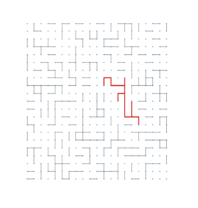
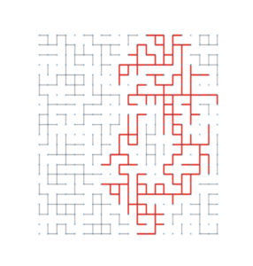
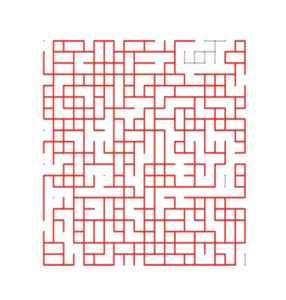
Next, in site percolation, each vertex of the lattice is independently labeled either open (with probability p) or closed. Edges connect open sites only. As we vary p, the system undergoes a phase transition: at the critical probability, a giant cluster emerges. The images at the start of this post represent the subcritical, critical and supercritical regimes for bond percolation, where the largest cluster is colored in red.
With NetworkX, simulating this process is straightforward. After generating the 2D grid as we did before, we simply have to remove vertices with probability 1-p. A self-contained script is given below, with comments appended using hashtags to explain each line.
import random
import networkx as nx


def percolate_lattice(n, p):
    G = nx.grid_2d_graph(2*n + 1, 2*n + 1) #generates the 2D grid of radius n
    closed = [node for node in G if random.random() > p] #creates a list of vertices to remove by checking repeatedly if each drawn random value is larger than the parameter p
    G.remove_nodes_from(closed) #removes the vertices from the grid
    return G
Once we have the percolated graph, we can now analyze it using NetworkX’s built-in methods. For example, to compute connected components:
components = list(nx.connected_components(G))
largest_cluster = max(components, key=len)
print(components)
NetworkX can return components as lists of vertices. Using further methods, we can examine their sizes, shapes, or whether they span from one side of the grid to the other. One central question in percolation theory is whether an open cluster connects opposite boundaries of the lattice. To test this, we check whether any component contains a node on the left boundary and a node on the right boundary.
def spans(component):
    xs = [x for (x, y) in component]
    return (min(xs) == 0) and (max(xs) == 2*n)
Iterating this check over all components in the list “components” allows us to understand the presence of spanning clusters across repeated trials. Finally, NetworkX can draw graphs using matplotlib. While drawing large lattices can be slow, for modest sizes the visualization can be illuminating. For example, the following snippet can be added to the previous ones to enable visualization of the percolated graph:
import matplotlib.pyplot as plt

pos = {(i, j): (i, j) for (i, j) in G.nodes()}
plt.figure(figsize=(6, 6))
nx.draw(G, pos=pos, node_size=10, linewidths=0)
plt.show()
Open nodes appear as connected points, while removed (closed) nodes simply do not appear. For more sophisticated simulations, including bond percolation (which is the model the pictures represent), or higher‑dimensional grids, NetworkX provides the flexibility to modify the underlying graph structure without changing the logic of the simulation. This post provides a simple entry point into using NetworkX to study graphs and networks. Its documentation provides a large number of additional tools and methods to perform precisely the tasks you may need.

This entry is licensed under a Creative Commons Attribution-NonCommercial-ShareAlike 4.0 International license.