Every spring semester, the digital fellows discuss their observations and findings from the fall semester about the Graduate Center’s students, faculty, and staff needs regarding technical skills, digital tools, or digital scholarship. The question we ask each other is, aside from the drop-in hours, workshops, consultations, user groups, and blog posts, how can we respond to the GC community’s immediate need(s)? Last year, the digital fellows held the Conversations in Digital Scholarship: a gathering of GC digital humanists and scholars to work through ideas and projects on five topics in round table discussions that culminated in a whole group reflection session.
This semester, the digital fellows found that many scholars, ourselves included, needed a space to workshop our digital projects and the work we do with data. After some considerations, we opened the Data Lab: an informal and interdisciplinary space to discuss all things data. On Friday, March 6th, we held Data Lab: Wrangle Your Date and on Thursday April 30th, we held Data Lab: Visualizations. Below, I mention some of the resources I found especially helpful for beginners and pedagogues. resources to get you started on your data journey or to use in your classrooms.
Data Lab: Wrangle Your Data
Digital scholarship begins with data. We observe something, ask a question about it, and then collect information to answer that question. The data we collect can range from the total number of complaints made to NYC 311 about city potholes to transcripts of interviews for an oral history project. Whether numerical or alphabetic, we need to collect, clean, sort, read, and analyze our data. We have the option to produce our own data or to retrieve accessible public data. Open public data sets are also helpful to use to practice cleaning, sorting, and analyzing data for scholarship or for pedagogical purposes. A few public data sources I find helpful are: NYC Open Data, Data is Plural, and, one of my favorites to use for text analysis, Project Gutenberg. Once you have found the data that responds to your query or learning objective, you will need to clean, sort, and manipulate it to narrate your research. One powerful method of data storytelling is data visualization.
Data Lab: Visualizations
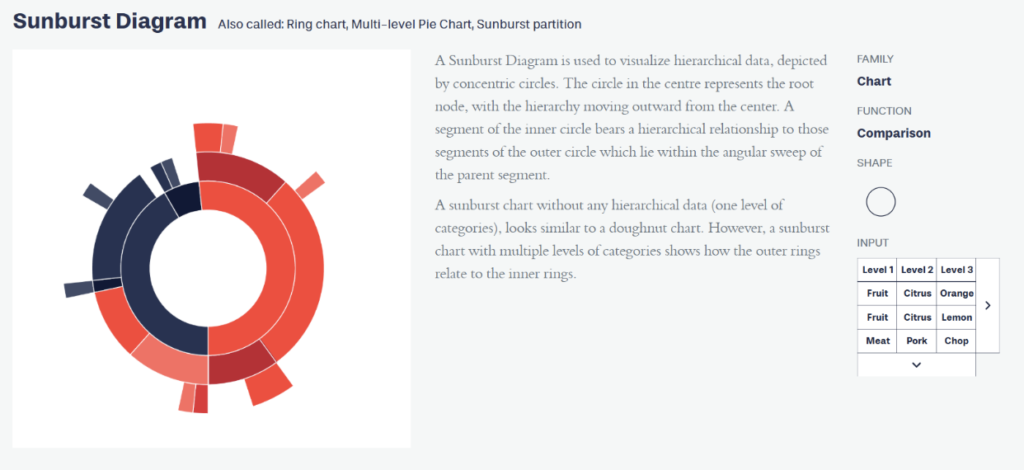
Who is your audience? This was the question at the beginning of our Visualizations session. Your audience and purpose determine your story and thus determine the type of visualization you use to narrate that story. A helpful resource for novice data visualizers and pedagogues is Data Viz Project. This project is a catalogue of visualization types. For each type, you can explore the visualization’s function, structure, and input requirements (i.e, how data should be organized). For example, if you want to compare data points, you can use the Sunburst Diagram. But, how do you know to use this diagram? You can either filter what you need from the homepage or you can select a visualization type and explore it further. On the visualization type page, you will find information about its design, purpose, family ( chart, diagram, graph etc.), function, shape, and input. For example, if I select the Sunburst Diagram, I quickly learn that it “illustrates hierarchical data in a radial layout” and functions to compare information. ( As a writing instructor, I wish there is a genre catalogue similar to this to assist students when they approach writing projects.)
The Data Viz Project catalogue helps you select the function (or the way you want to tell your story) and organize your data for the desired purpose (e.g. present your findings to an interdisciplinary dissertation committee or show the use of gendered language in LLMs to undergraduate students). Like any good story, data must be structured to create a vivid and lasting image in the reader’s mind. Data visualizations are like the metaphors that capture the audience’s attention and reveal the deeper meanings and connections of a research project.
As we continue to tell our stories and guide our students to tell theirs, I encourage you to visit our Data Literacies curriculum on DHRIFT and to learn from Data Visualizations experts at the Open Visualization Academy. Of course, remember to subscribe to our calendar for upcoming Data Lab sessions and come explore data cleaning, sorting, ethics, management, and more!

This entry is licensed under a Creative Commons Attribution-NonCommercial-ShareAlike 4.0 International license.