
If you’ve ever loaded a research dataset into Tableau, you’ve probably been a bit intimidated. The interface templates are set up to analyze things like “Regional Sales” or “Shipping Costs,” leaving those of us researchers with census tracts or survey data feeling like we’ve picked the wrong tool for the job.
But with a little massaging, Tableau can be great for visualizing datasets for academic research—provided you stop using it the way an MBA would. The trick is knowing which business features to ignore and which research-specific workflows to lean into.
Here are some tips to breaking into the Tableau biz:
1. Embrace Long Data
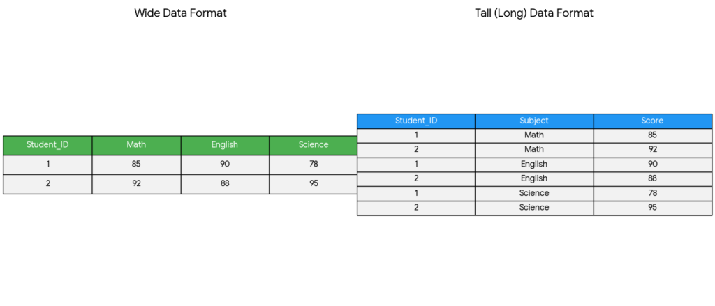
Academic datasets often come in a “wide” format, where each subject has a single row followed by dozens of columns for different variables or time points. Tableau, however, functions best with long data. If you keep your data wide, you’ll be forced to manually drag every individual variable onto your workspace, which is tedious and limits your analysis.
To fix this, go to the Data Source tab, select your variable columns, and click Pivot. This transforms your data by collapsing those many columns into just two: one for the Variable Name and one for the Result. This single step allows you to use a simple filter to toggle through every data point in your study, making your workbook much easier to manage and scale.
2. Find the Tools for Distribution
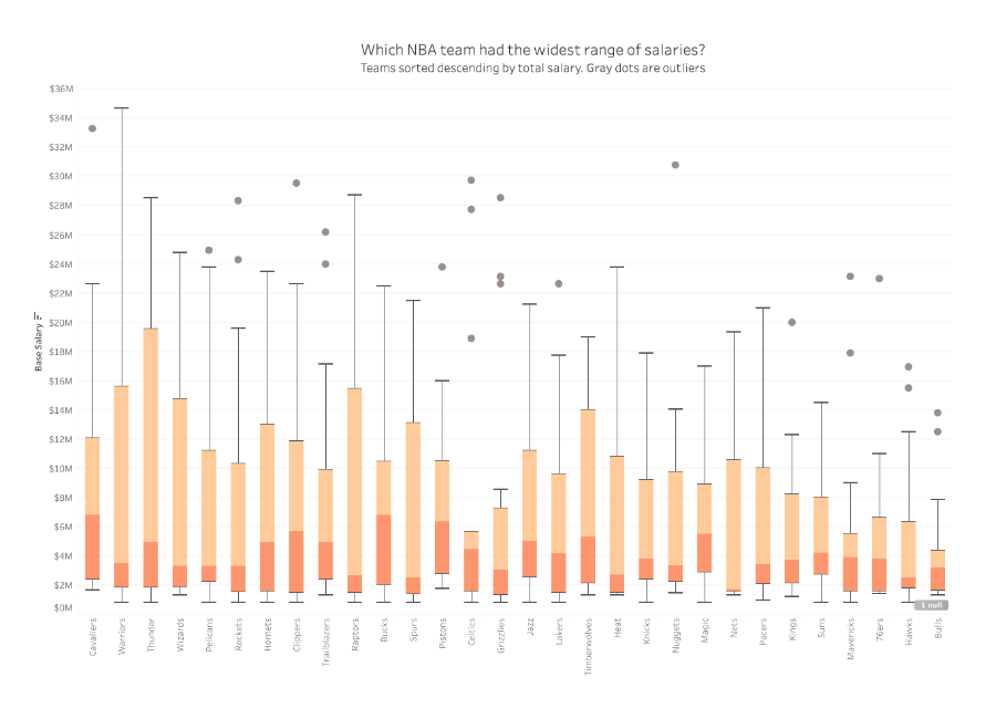
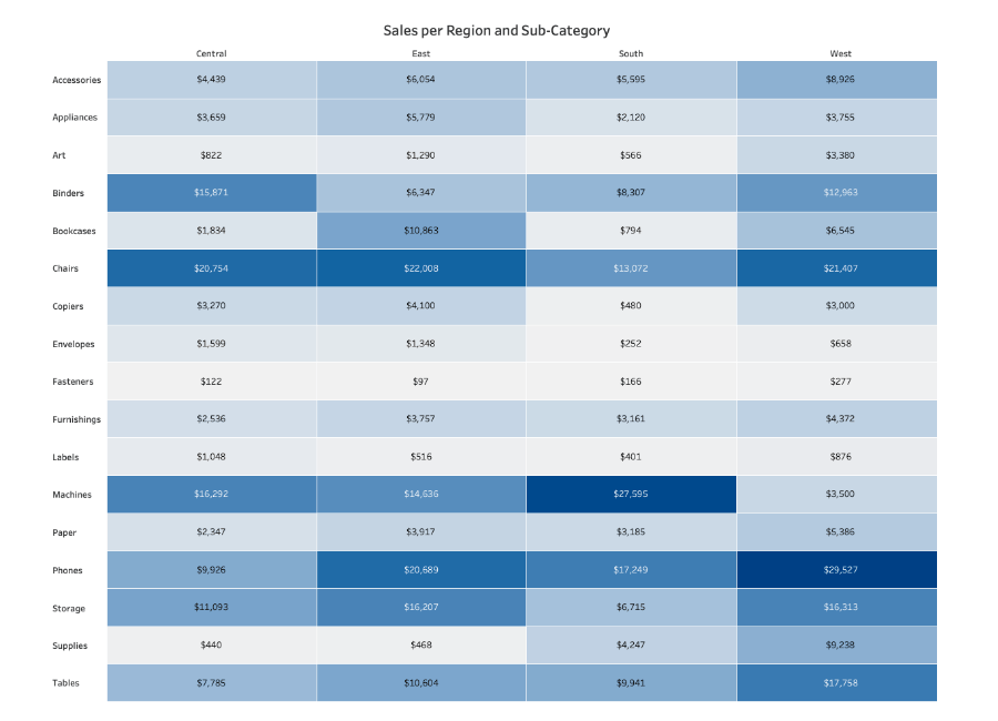
In a corporate dashboard, “Total” or “Average” is usually enough. The default visualization options in Tableau usually work in these terms. But in research, the average is often just the beginning of the story!
Switch your default visualization from bar charts to something like Box-and-Whisker Plots. Box-and-Whisker Plots give you an immediate look at the spread of your data. It’s a much more transparent way to present findings because it doesn’t hide the variance. If you’re dealing with categorical data, a Highlight Table is often better than a chart, since it maintains the precision of the raw numbers while using color density to reveal patterns across categories.
3. Normalize Populations
A common mistake in spatial research is mapping raw counts, such as “Registered Democrats” or “Disease Cases.” Because more people live in cities, raw counts usually just result in a map of the most populated areas rather than showing where a phenomenon is actually most intense. Because Tableau is set up for sales data, it emphasizes raw counts over proportions or density.
To normalize your geographic data, always create a Calculated Field This allows you to compare a small rural county to a major urban center on equal terms by looking at the rate of occurrence, not just the total volume.
4. Prove Your Trends Are Actually Real
Tableau makes it very easy to add a
“Trend Line” to a chart, but just because a line is there, it doesn’t mean that the data actually supports the line. In research, a trend line is basically a “best guess” at a pattern. Before you trust it, you need to check if that pattern is a real discovery or just a random coincidence.
To check this, right-click your trend line and select Describe Trend Model. Look for these two numbers:
- The p-value (The “Chance” Score): At risk of oversimplifying, this number tells you if your pattern is likely a fluke. Generally, you want this number tobe 0.05 or smaller.
- The R-squared (The “Fit” Score): This tells you how closely your data points actually follow the trend line. It’s a scale from 0 to 1. A score of 0.90 means the dots are hugging the line pretty perfectly. A score of 0.10 means the dots are scattered all over the place, and the line isn’t doing a great job of explaining them.
5. Use Tooltips for Context
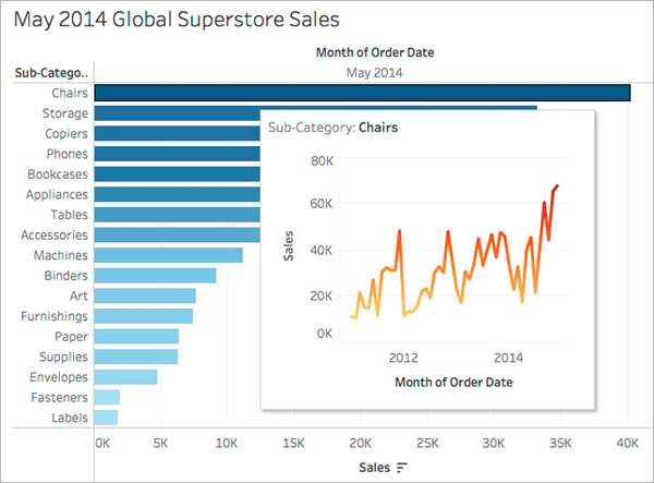
In a corporate dashboard, tooltips (the boxes that pop up when you hover over a data point) usually just repeat the numbers you can already see on the screen. In research, you can use this space to provide the qualitative context that a chart can’t show on its own.
Instead of just showing “Sales per Month” you can customize your tooltip to include citation information, specific notes about that data point’s collection, or a brief explanation of why a particular value is an outlier.
The Bottom Line
Don’t be intimidated by the business lingo. Just because Tableau is corporate software doesn’t mean that you have to use it that way. With just a little retooling away from tracking business analytics, Tableau can be a powerful tool for quick and professional data visualization!

This entry is licensed under a Creative Commons Attribution-NonCommercial-ShareAlike 4.0 International license.