In Python, the most widely used library for creating various kinds of visualizations is Matplotlib. In this post, we will introduce the core ideas behind Matplotlib and illustrate them through simple, concrete examples that can serve as modular foundations for more advanced visualizations. Matplotlib is a low-level plotting library that gives the user fine-grained control over every aspect of a figure. While higher-level libraries such as Seaborn or Plotly build further on this foundation, Matplotlib remains the backbone of most scientific plots produced in Python. The design of Matplotlib is inspired by MATLAB, which makes it intuitive for users with a background in numerical computing.
Let us begin with a simple example, of a ”line plot,”, i.e., a typical two-dimensional plot of a function of a single variable. The most common way to get started is by using the pyplot interface, which provides a state-based, convenient syntax for creating plots. This is enforced by importing Matplotlib as follows:
import matplotlib.pyplot as plt
Following this import command, we use NumPy to call the mathematical function sin(x), and visualize it as follows:
import numpy as np
x = np.linspace(0, 10, 100) #generate 100 evenly spaced points from 0 to 10
y = np.sin(x)
plt.plot(x, y)
plt.xlabel("x")
plt.ylabel("sin(x)")
plt.title("A Simple Line Plot")
plt.show()

Here, NumPy is used to generate evenly spaced points and call sin(x), and Matplotlib draws a smooth curve connecting them. The functions xlabel, ylabel, and title allow us to annotate the figure. There are further customization options available in the documentation, which is linked at the end of the post.
In addition to simple plots such as these, Matplotlib supports a wide range of plot types. Let’s look at a few of them.
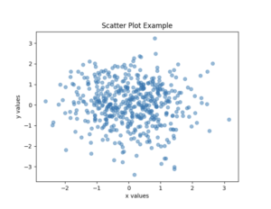
Scatter Plots
Scatter plots are useful for visualizing relationships between variables, especially when dealing with noisy data. Here is an example:
x = np.random.randn(500)
y = np.random.randn(500)
plt.scatter(x, y, alpha=0.5)
plt.xlabel("x values")
plt.ylabel("y values")
plt.title("Scatter Plot Example")
plt.show()
In this example, we use NumPy to generate a random set of x and y values, which we then plot with Matplotlib.
Histograms
Histograms, on the other hand, summarize data by grouping values into bins and counting their frequencies.
data = np.random.randn(1000)
plt.hist(data, bins=30)
plt.xlabel("Value")
plt.ylabel("Frequency")
plt.title("Histogram Example")
plt.show()
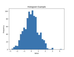
Once again, the data is randomly generated using NumPy, before we use the hist method of Matplotlib’s pyplot to generate the histogram image.
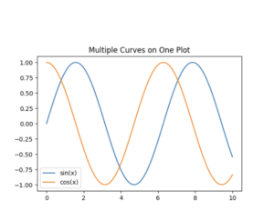
Multiple Curves and Customization
One of Matplotlib’s strengths is the degree of customization it offers. Nearly every element of a plot can be controlled: line styles, marker sizes, fonts, tick marks, and figure dimensions. For instance, we can easily adjust the size of a figure and plot multiple curves on the same axes.
plt.figure(figsize=(6, 4)) #adjust figure size
plt.plot(x, np.sin(x), label="sin(x)") #plots sine
plt.plot(x, np.cos(x), label="cos(x)") #plots cosine
plt.legend()
plt.title("Multiple Curves on One Plot")
plt.show()
Matplotlib also allows the creation of figures with multiple axes, which is useful for side-by-side comparisons or more complex layouts. While the pyplot interface is sufficient for many tasks, more advanced use cases often benefit from working directly with the Figure and Axes objects.
This post has provided a brief introduction to Matplotlib’s basic functionality. With these tools, you can already produce a wide variety of informative and polished figures. As your needs grow, Matplotlib’s extensive documentation offers detailed guidance on advanced topics.

This entry is licensed under a Creative Commons Attribution-NonCommercial-ShareAlike 4.0 International license.