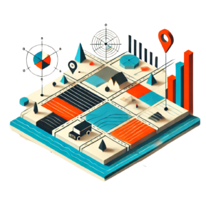
Story maps have exploded in popularity lately, becoming the go-to tool for effectively communicating data-driven narratives across fields like education, journalism, research, and urban planning. Their strength lies in effortlessly weaving together data visualization and narrative, making complex spatial information approachable and engaging—even for those who might not know the first thing about traditional cartography. It’s no surprise that both teachers and researchers find them particularly appealing; story maps offer an accessible platform for students and teachers to explore spatial stories, especially by combining various modalities of information.
But as story maps spread far and wide, an interesting tension emerges: their true effectiveness often relies less on sophisticated cartographic know-how and more on the craft of visual storytelling itself. I noticed this, particularly during a recent story mapping workshop I led. Participants mostly came as beginners to mapping. At the outset, I thought what I needed to spend the most time on would be grappling with the many technical intricacies of mapping. But that wasn’t really the case, since those were far easier to communicate or execute than the visual effectiveness of the maps. That can be problematic since maps, despite their apparent simplicity, inherently embed significant messages through subtle choices around scale, framing, direction, and symbolism. This is where visual literacy becomes critical. Broadly defined, visual literacy is the ability to interpret, negotiate, and create meaning from visual information—a skillset essential for both interpreting and making effective story maps. Recent research also points out that good visual communication—especially interactive visualizations—depends heavily on understanding user attention, consciousness, and memory. Basically, a map isn’t effective if it can’t hold your attention or stick in your memory (He, 2022). Participatory mapping initiatives like OpenStreetMap marathons (mapathons) further highlight that visual literacy isn’t just passive; it’s deeply tied to active engagement with visual information (McGowen, 2020). Contemporary research even pushes for new interdisciplinary frameworks to understand visual methods, showing how central visual communication has become in working with spatial data. Intriguingly, recent neurological studies show that the brain processes visual contrasts, colors, and symbols in maps in ways that significantly shape how—and if—we actually remember or care about the visual stories we see (Hu & Hwang, 2024).
Another lens that helps us unpack the subtle complexities of map-making is semiotics—the study of signs and symbols. I know it seems repetitive, but here it goes again: Maps aren’t neutral; every symbol, color, and line is loaded with cultural, social, or political significance. Understanding the semiotics of maps helps creators and audiences recognize these implicit narratives and makes us more thoughtful storytellers and readers alike. As cartographic semiotics expert Emanuela Casti points out, maps don’t merely represent reality—they actively shape our perceptions of places and the actions we take within them.
Given these insights, what makes a story map effective? It’s all about thoughtfully combining visual literacy, semiotics, and good old-fashioned narrative storytelling. Practical considerations like scale, color, direction, and context become crucial narrative tools. Scale determines what’s emphasized or hidden, color influences emotional reactions, direction guides viewers through your story, and context helps people understand why your map matters in the bigger picture. Being deliberate about these visual components can elevate your map from something merely informative to something genuinely compelling.
Yet even knowing this doesn’t guarantee success. Common pitfalls still trip up many aspiring visual storytellers. You might recognize a few of these from your own experiences (no judgment—maps are tricky!):
- Vague or missing annotations: Good maps clearly label significant features, making sure the audience knows exactly what they’re looking at—and why.
- Disconnected narratives: Visual data should explicitly tie back into the broader story. Otherwise, you’re just mapping things without context, leaving readers wondering why it matters.
- Ignoring visual hierarchy: Without clear visual hierarchies, viewers get lost or overwhelmed. Think of it as telling a story without punctuation—it’s easy to lose the plot!
- Information overload: If a map is cluttered with extraneous details, it’s less a narrative and more of an eye exam.
- Randomized visual elements: Consistency is key. A hodgepodge of colors, symbols, and fonts makes your map look like a visual puzzle instead of a coherent story.
To sidestep these pitfalls, here are a few guiding principles to keep your story maps engaging, effective, and visually literate:
- Prioritize Clarity: Annotate thoughtfully. Label critical information and explicitly connect visuals to your narrative.
- Simplify Ruthlessly: Only keep what’s essential to your narrative. Your audience will thank you.
- Leverage visual hierarchy intentionally: Direct viewers’ attention to key elements by strategically adjusting color contrast, scale, and emphasis.
- Engage purposefully: Use interactivity and multimedia thoughtfully—just because you can add animations doesn’t mean you always should!
Practically speaking, visual literacy and semiotics offer invaluable tools for educators, researchers, journalists—and pretty much anyone telling stories with spatial data. Cultivating these skills helps both creators and audiences critically engage with maps, encouraging thoughtful interpretation and informed interactions.
Ultimately, the rise of story maps highlights a broader shift: visual literacy is becoming a necessary skill for anyone engaging with digital narratives. As story maps transform how we communicate spatial data, mastering visual storytelling becomes just as important as mastering geographic tools themselves. Whether you’re mapping flood risk, historical trends, or the best coffee shops in town, understanding the subtle power of visual communication is the secret to making your maps meaningful, memorable, and—most importantly—impactful.
References:
He, X. (2022). Interactive Mode of Visual Communication Based on Information Visualization Theory. Computational Intelligence and Neuroscience, 2022, 4482669. https://doi.org/10.1155/2022/4482669
McGowan, B. S. (n.d.). OpenStreetMap mapathons support critical data and visual literacy instruction. Journal of the Medical Library Association : JMLA, 108(4), 649–650. https://doi.org/10.5195/jmla.2020.1070
(PDF) Cultivating visual literacy and critical thinking tendency with technological knowledge organizing supports: A concept mapping-based online problem-posing approach. (2025). ResearchGate. https://doi.org/10.1007/s11423-024-10394-6

This entry is licensed under a Creative Commons Attribution-NonCommercial-ShareAlike 4.0 International license.