Geographic Information Systems (GIS) are an essential digital tool for the creation and analysis of maps and geographic data, as it offers a wide array of analysis possibilities to scholars who are interested in the geospatial elements of their research projects. This post will guide you through the very basics of GIS mapping concepts. Then, we will use QGIS to project a map and do some basic analysis and drawing functions on it.
Why QGIS?
There is a variety of platforms and tools to analyze geographic information. Former Digital Fellow Keith Miyake posted a couple of great guides for mapping using CartoDB and ArcGIS Storymaps. More recently, my colleague Digital Fellow Kristen Hackett posted this awesome guide on using Social Explorer to Spatialize Demographic Data. Also, a recent Digital Fellows initiative relied actively on GIS and other mapping tools to Visualize the National Endowment for the Humanities Open Data. I decided to go with QGIS because it is an open-source software that offers a powerful and adaptable platform to do GIS analysis, and although it may seem scary the first time you open it (what are all those buttons for!?) with this guide I hope to reduce that fear any first-time user may have and gain some knowledge and confidence in using a GIS platform. It is important to note that all GIS platforms have different interfaces, but knowledge of the basic concepts and navigating a bit through QGIS will allow you to identify similar elements in other GIS software, such as proprietary-yet-popular-and-powerful ArcGis or other open-source options such as gvSIG.
A very basic approach to GIS Lexicon
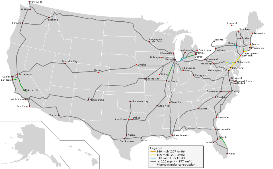
A good way to start talking about GIS Lexicon is looking at a conventional map and analyzing the information it shows:
User:Theshibboleth Routes derived from Amtrak-Streckennetz.svg Speed limits own work. Inspired by High_Speed_Railroad_Map_of_Europe_2013.svg
This map shows the current rail speeds in the United States. Even without a title, we know it’s the United States because we recognize its shape, and we also don’t need a legend to identify the state boundaries in white. Then we have railroad information (the lines) and their respective speeds (represented in different colors, according to the legend), plus cities that have railroads (red dots) and the states (gray polygons). We are going to refer to these points, lines and polygons as features.
Data in QGIS is organized in layers. To understand layers, imagine that you have several different onion paper sheets, each one with a different type of features. For example, you could have one onion paper sheet to display US states, another one to display only railroads, and a last one to display just the red dots that represent the cities, so that when you put them one on top of the other, they would look like the map above. Each of these features is represented as a vector, that is, scalable points, lines or polygons that can be easily created, edited, or deleted using QGIS.
Data in each layer is of the same type, so they can have comparable attributes. For example, in the cities layer, you could include population, and you could compare the population of Miami to the population of Dallas. You could also have total population in the states layer, but you couldn’t have it in the railroads one, as that wouldn’t make sense. Likewise, the railroads could have an attribute for average speed, but this attribute wouldn’t make sense in either the states or the cities layers. So, each layer will have its own attribute table, which is basically a spreadsheet showing each feature as a row, and each attribute as a column. Just like in stats software, attributes can contain data as strings (text), numeric, dates, or booleans. GIS files will also include geographic data that tells QGIS what vectors to create for each feature (be it points, lines or polygons), that will be represented in space according to a Coordinate Reference System (CRS), which is basically a reference for QGIS to know how to transpose aspects in a three-dimensional spherical world into two-dimensional rectangular representations. All layers in your map must be on the same CRS, otherwise data will be inaccurate or even incompatible.
Bear in mind that data might not have geographic information but still be used in QGIS. For example, if you have an excel spreadsheet with data about the states, and vectors representing states but with no attributes, you can join them and all the data in the spreadsheet will become attributes for the vector layer. You could also start from scratch and draw yourself each state, but the result would likely be inaccurate. In any case, the process of using geographic data to represent features on a GIS is called georeferencing. You will likely not have to worry about georeferencing as most of the data you can find on the internet is already georeferenced. Vector layers are commonly shared in shapefile format (.SHP). Shapefiles in GIS generate many files with the same name but different formats, and they all need to be in the same location for QGIS and other GIS software to open them correctly. Remember this when saving and copying layers. To tackle this inconvenience, GIS software has evolved and allows to read compressed files (i.e. .zip, .gz) that already contain all of the related files required by the layer.
There are other types of layers besides vector layers. The other most common type of layer is raster layers, which consist of satellite images or maps for reference, aesthetics or additional information, such as grayscales or heatmaps where colors or intensity reflect a varying numerical value. Unlike vector layers, these have a specific resolution that determine how accurate the information is (and the filesize, too!), and are commonly used for continuous data such as temperature and elevation. They can also be turned into vectors using QGIS, although for the data to be usable, thresholds and cutoffs must be used to narrow data in bins (i.e. elevation 0-10m; 10-20m; 20-30m…). raster layers are commonly shared in Tiff format, and the images contain metadata including georeferenciation (normally, the coordinates of each corner), and the numeric values stored in bands, which were used to generate the colors in the image.
Ok, now that we saw some of the basic GIS lexicon, let’s proceed to do an exercise to get us started with QGIS.
QGIS – Setting up
The first step is to download and install QGIS here. While it downloads, I will explain what we will do, and give you the links to download the files that we will use.
Let’s imagine that there will be a flood in the East River and Hudson Rivers, because of neglect on climate change policy. We know that the flood will reach as deep as 500 meters inland (sorry, we’ll use meters for this whole exercise), and houses located anywhere under 15 meters above the sea level may be affected. Our task is to identify the blocks in a specific area of Manhattan that will be affected the most by this flood.
For this exercise, we will use:
- A vector layer showing the census blocks in New York City;
- A vector layer with the hydrography of New York City; and
- A raster layer with the elevation of a specific quadrant in New York City.
We will get all three required layers from the Cornell University Geospatial Information Repository (CUGIR) website. If you want the real-world experience, go ahead and log into the CUGIR website and try to look for current datasets of New York City, specifically, the Census Blocks 2000 and the Hydrography (Census 2000) (Hint: they’re both here). As for the raster image, look for the Digital Elevation Map (DEM) 10m raster of the Central Park quadrant in New York City (Hint: it’s here). For convenience’s sake, you can download all three required layers in a single Zip file here. Decompress this Zip file in a familiar and easy-to-access folder. You should see three different folders that I labeled BLOCKS, HYDROGRAPHY and ELEVATION, each with their own files and folders inside (note that if you downloaded the files yourself from CUGIR they won’t have these names, but instead a generic CUGIR name and numbers).
Once you finish installing QGIS and downloading the required layers, go ahead and open the QGIS Desktop app. After loading time, you should see something like this:

Adding Layers
On the image above I highlighted a few areas and buttons related to layers: The Add Vector Layer button, the Add Raster Layer button, the Create New Layer button, and the Layers Panel. We will not use the Browser Panel so you can go ahead and close this one clicking on the X on the top-right corner of the panel.
Whenever you add a layer to your project, it will be shown in the Layers Panel. Let’s go ahead and open the Census Blocks layer by clicking on the Add Vector Layer. A dialog like this one should open:

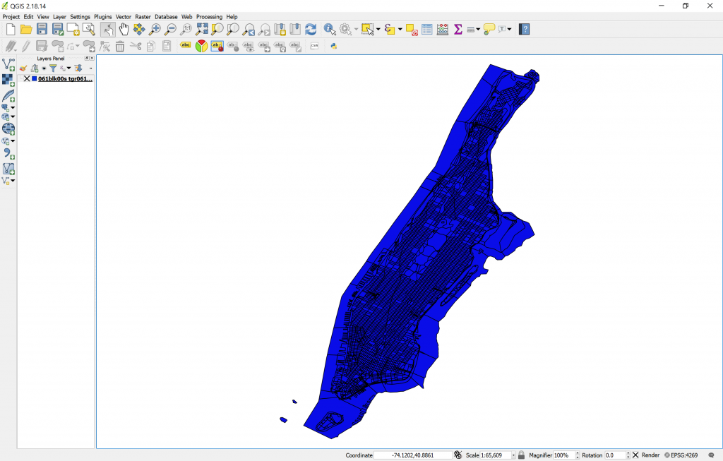
Here, click on Browse, go in the BLOCKS folder and select the 061blk00s.zip file directly. When you select it and click on Open, you should get this:
Layer Properties / Customizing Layer
As you can see from the shapes in the layer, this is a polygon vector layer. Each polygon represents a census block, and all together compose the shape of Manhattan. Note that the color of your layer might be different; QGIS chooses layer colors at random when you first open or create one. If for any reason you’d like to change the color of the layer, you can do it by double-clicking on the layer name in the Layers Panel (“061blk00s tgr061…”) to bring up the Layer Properties box. There, you can click on the Style tab on the left side and you’ll be able to customize the look and color of the layer. To change the color, click on the colored bar drop-down where it says “Color”. Above it, you’ll notice a transparency bar, which can come in handy if you want to visualize more than one layer that overlaps. Go ahead and experiment with the styles and choose a visualization to your liking.

Since you’re already on the Properties box, click on General so that we can check out the Coordinate Reference System. You will see that this layer’s CRS is “Selected CRS (EPSG:4269, NAD83)”. Keep that in mind and close the Layer Properties dialog box.
The Attribute Table
Right-clicking on the layer name in the Layers Panel will open up a menu with several options that you can fiddle with. Let’s look at the one called “Open Attribute Table”. When you do, you will see a spreadsheet-like list of every feature in that layer. Remember, every row is a single feature in the layer, and if you put the attribute table and the map side-by-side, you’ll see that every time you select a row, a specific area of the map will be highlighted. You can also select several rows at a time and the according features will all be highlighted in the map. The opposite is true as well: if you select a feature in the map using the “Select Features” button on the top menu, the same feature(s) will be selected when you open the attribute table.

Adding a Second Layer / Harmonizing CRS
Now that we’ve played a bit with the attributes in a layer, let’s go ahead and open a second layer: the Hydrography one (061hyd00s.zip). Open it following the instructions for the Blocks layer. If you did it right, you will end up with a new window we hadn’t seen before, called the “Coordinate Reference System Selector”. The reason this happens is because the Hydrography layer, for some reason, did not have information about the CRS. So it is up to us to choose which CRS we want it to be projected on (Note: if you did not get this dialog box, it could be due to the fact that On-the-fly CRS is on, which means that all layers you open will be adapted to the CRS of the first layer you opened, but if this is your first time using QGIS, you should get the same box I did).

Now, since you want all layers to be in the same CRS, go ahead and look for the same projection of the Blocks layer (remember I told you to look at it on the Layer Properties dialog box?). Look for EPSG:4269, NAD83. You can write EPSG:4269 in the filter box and it will facilitate the search for you. Once you select the proper CRS, click OK and the layer should be projected on top of the Blocks one, like this:

Congratulations, now you have two layers on QGIS! Feel free to explore the new layers attribute table, properties, change the color, and I also recommend that you rename both layers to something more practical, like “Blocks” and “Hydro”. This is a good idea so that you can always easily locate the main layers, as the operations that we will do will multiply the number of layers. To rename a layer, right-click on its name and select the last option in the menu, “rename”. You can also toggle the visibility of layers on/off by clicking on the X to the left of the layer’s name. This may come in handy in the future.
Adding a Raster Layer
Now, let’s get the third layer into play: the raster layer. To open it, we must click on the Add Raster Layer button, right below the Add Vector Layer button. Then, we search for the Elevation folder, and click on hh47elu.dem.gz. When we do, a black square image will appear on the map area:

That raster is a Digital Elevation Map, and the colors reflect altitude: the dark levels are 0, while the white levels are the higher altitudes. Let’s explore the raster layer a bit. I chose to rename mine “Elevation Raster”. In the properties dialog box, we can see in the General tab that the CRS for this raster layer is very different from the other two layers; still, the layer is perfectly aligned with the other two on the map. Why? Because QGIS has an option called On-The-Fly, which aligns all projections to the CRS of the first layer you opened. You can check that On-The-Fly is active by looking at the lower-right area of your QGIS window, where you will see EPSG:4269 (OTF). The OTF means On-The-Fly is active, and it was not active before we opened this new raster layer.
Creating a New Shapefile Layer
Also note that the square does not cover the whole Manhattan, but just a fraction of it. For practicity’s sake, we will define this square area as our “study area”, so we will disregard anything that is not within this box. To do this, we will create a new layer from scratch, and we will draw a polygon in the shape of the raster layer. To create a new layer, click on the bottom button in the Layers bar, called “New Shapefile Layer” (looks like a V with a small yellow star next to it). Go ahead and click on it. You will get the Create New Shapefile Layer dialog box:

Here, make sure to select “Polygon” as the type. Then, click on the drop-down for the CRS and make sure you choose EPSG:4269, NAT83 as the CRS, instead of the default EPSG:4326, WGS 84. Don’t worry about anything else because this will just be a tool layer that will help us clip the other two layers to the study area. Go ahead and click OK, and QGIS will prompt you to Save the blank layer on your hard drive. Go ahead and do it, and let’s call it Study Area. Study Area will be added to your Layers Panel, but we can’t see anything because it doesn’t have any features yet. Here we only need one feature, and we are going to draw it, tracing a square over the Raster image.
Toggling Edit On / Drawing a Polygon
To draw the Polygon, we have to Toggle editing mode on, by clicking on the Pencil icon (second icon from the left in the second toolbar). As you click on it, you will noticed that previously greyed-out icons will be enabled. Two icons right of the “Toggle editing” button, you will find the “Add feature” button (looks like a blob with a small yellow star to the right), which is precisely what we need, so go ahead and click it. Now your cursor is armed to draw. Click on the upper-right corner of the raster image, then on the lower-right, then the lower-left and finally the upper left. Then right-click. Don’t worry if you’re not super-precise; for this exercise we don’t need surgeon precision, we’re just practicing, exploring and learning.

Once you right-click, a box will pop-up asking you to write an id. You can leave this blank and click on OK. When you do, a colored square will cover the whole raster image area. Since we don’t need to edit this layer further, click on the Toggle editing button again. A dialog will ask you if you want to save the changes, say yes.
Geoprocessing Tools: Clipping
Now we are ready to do some operations. We will use the Vector Geoprocessing Tool called Clip, to crop the area of the Blocks layer to the study area. We don’t need to crop the Hydro layer because the target of our study is the Blocks, not the hydrography. So in the menu toolbar, click on the Vector menu, then in the Geoprocessing Tools, click on Clip.
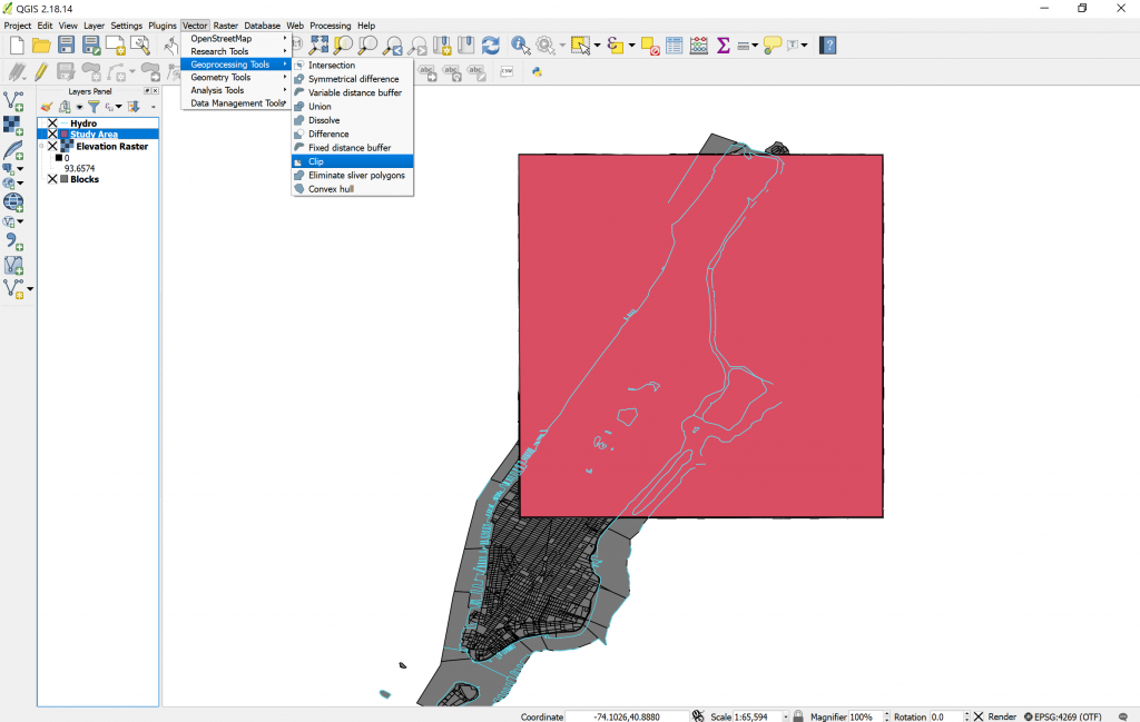
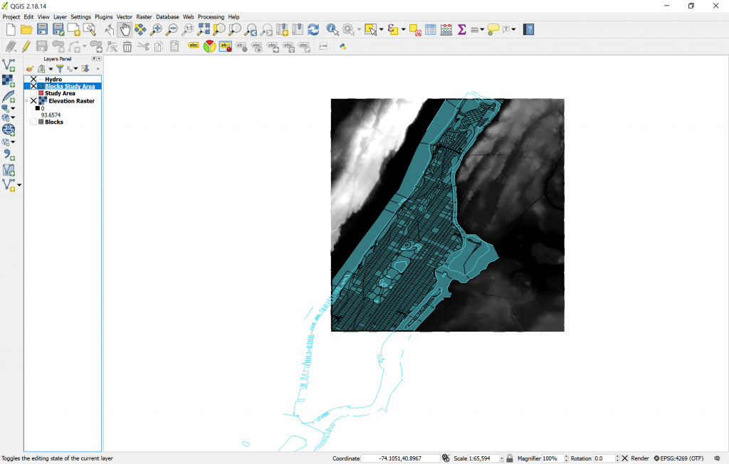
In the Clip dialog box, you will choose Blocks as your input layer, and Study Area as your Clip layer. In reality, QGIS never really edits layers when you do operations to them, instead, it creates a new layer resulting of your operation. In the “Clipped” box, you can specify the name of the new layer, or you can leave it blank to create a temporary layer. I suggest you leave it blank because we will clip this further to determine the areas vulnerable to flood. The resulting layer when you click OK will be named “clipped” by default, let’s name it “Blocks Study Area”. If you toggle the Blocks layer visibility off, you will notice that the Blocks Study Area layer looks like a copy of Blocks, limited to the square of the study area. If you look at the Attribute table of the Blocks Study Area layer, you will notice that it has all the same attributes than the original Blocks layer, only that the features that were outside of the study area were deleted, which is just what we wanted. Now we can permanently turn off the visibility of Blocks and of Study Area (clicking on the X’s to the left of the layer names), and our work should now look like this:
Creating a Buffer Zone / Installing and using a plugin
The next step in our task is to calculate the inland areas that will potentially be affected by flood. We will achieve this following two steps: the first step is to create a buffer zone of 500m from the coastlines (defined by the Hydro layer lines), and the second step is to confront that buffer to altitude, to make sure that our map shows areas that would be safe because they are higher than 15m above the sea level. For the first step, we could create a buffer using the “fixed distance buffer” geoprocessing tool (in the same menu we found Clip), however, we won’t do that because I always have a hard time with the distance; for some reason the layer is not projected in the project’s CRS and the distances go crazy. So we will take this opportunity to introduce one of the awesome things about QGIS: Plugins.
The Open-source nature of QGIS means that many people around the world are constantly developing plugins that improve the capabilities of the software. In this case, we will download a plugin called MMQGIS that offers many practical tools that always interpret distances accurately, regardless of the CRS you’re using. Note that to install plugins you’ll need an internet connection, but if you’re reading this, I’m guessing you have one.
Ok. Click on the Plugins menu, and then on “Manage and Install Plugins…”. Wait for the list to load, then write mmqgis on the Search bar. Click on MMQGIS on the results and then you can proceed to read the description of the plugin and then click on Install plugin.
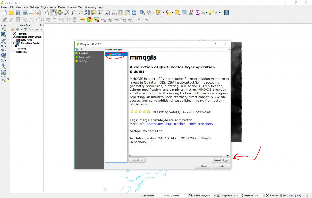
Now, you’ll notice that a new menu MMQGIS showed up on your Menu Toolbar. Go ahead and click on it, then on Create, then on Create Buffer.

My Create Buffers box looks a bit distorted because of screen resolution, but it works just fine. Here, choose Hydro as the source layer, then select a Fixed radio of 500 meters. Name the Output Shapefile “Hydro buffer” and place it in a convenient directory in your computer. Leave everything else as is, and click OK. Your result should look something like this:

Notice that in the middle of Manhattan there are some buffers, too. These ones were generated from the lakes in Central Park, but since lakes are not flooding, we can delete them. To delete them, just toggle editing on the Hydro buffer, select those circles in the middle and press the Del key on your keyboard. Voilà, they’re gone. Toggle editing off, save the changes on the layer and let’s move on.
Extracting the Contour from a Raster Image
So we have the first step ready. Now comes the second step, which is to contrast this buffer versus the elevation. Since rasters and vector layers have limited interaction, let’s make a vector layer out of the elevation raster so that we can do an operation between the Hydro buffer and elevation. To do this, we are going to click on the Raster menu, then Extraction, and finally Contour. In this dialog box, the input file will be the Elevation Raster. The Output file, let’s call it Elevation Vector (put it in the same folder as everything else), and for the interval contour between lines, lets make it 15. We know this elevation map is in meters, so the first produced line will be from 0-15m, then the next one from 15-30m, and so on. Although we only care about the differentiation between whether it is above or below 15m elevation, as in this exercise, that’s the threshold between potentially flooding and not.

Geometry Tool: Lines to Polygons
When you click OK, you will know you were successful if colored lines appear in the contours of the white areas in the raster image. To make the distinction clearer, we will turn these lines into polygons, using a geometry tool located in the Vector menu, called “lines to polygons” (in the Geometry Tools submenu). Run it, and you will get yet a new temporary layer showing solid areas. These areas represent everything that is over 15m elevation in the Study Area. In the New Jersey shore there may be areas of the vector that do not match the raster, but do not worry about that; that happens because the processing tool gets confused with the elevation lines and doesn’t know when to interpret a line as higher or lower elevation. But this does not occur in Manhattan so we do not need to do a more tedious work of singling-out the 15m elevation line, making lines to close the elevations and re-running the lines to polygons tool.
Harmonizing CRS again
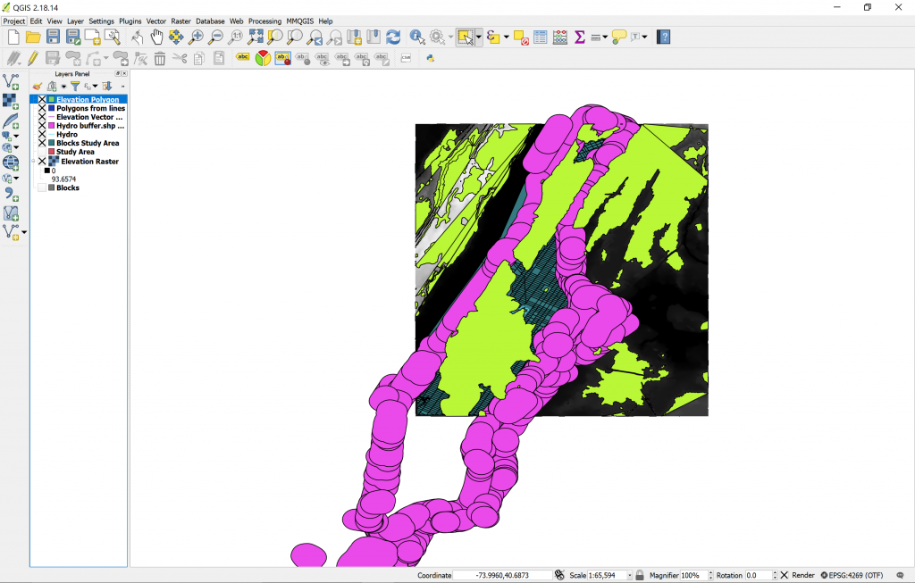
But that doesn’t mean we don’t have tedious work at hand. For instance, look at the properties of the new Polygons from lines layer. It adopted the CRS from the raster image, that is, EPSG:26718, NAD27 / UTM Zone 18N. This is not good because if we try to use geoprocessing tools when layers have different CRS, this may bring unexpected (crazy) results. And as easy as just clicking on the drop-down and choosing the project’s CRS for this layer sounds, this is not the solution, because then unexpected (crazy) things may happen, like the layer just disappearing. Instead, we need to “Save as…” the Polygons from lines layer, and in the Save as dialog, we can choose the proper CRS, that is… YES, you got, it, the EPSG:4269, NAT83. So let’s do that. Right-click on the Polygons from lines layer in the Layers Panel, click on Save as…, let’s call the new layer “Elevation Polygon”, select the proper CRS and voilà, the “new” layer will be added to your view. You will have to change the CRS for the Hydro Buffer as well, but for some reason, this one works fine if you change it from the drop-down in the layer Properties. So go ahead and do that.
Geoprocessing Tool: Difference
Now we’re ready to confront the hydrography buffer versus the elevation. To do this, let’s use a tool called “Difference” in the Vector/Geoprocessing Tools menu. Difference is a function like a geographic substraction: Wherever the two layers meet, the input layer will have substracted whatever trespasses the inner boundaries of the Difference layer. So let’s use the Hydro Buffer as the input and the Elevation Polygon as the Difference layer. Be sure to check the “Ignore invalid input features” so that the operation goes smoothly.

Clipping once again… and Final Result!
Now we have a new layer called Difference. We are approaching the end of this brief exercise, so let’s clean the view a bit and turn off the visibility of all layers except for Difference, Blocks Study Area and Elevation Raster (you can turn this last one off if you want to, but I like how it looks so I keep it on). The last step is actually repeating an operation we already did earlier… it’s clipping! We are going to clip the Blocks Study Area layer using the resulting Difference layer as a clipper, this way, we will have a layer that contains only the Blocks that will actually be vulnerable to the floods! So let’s rename this new “Clipped” layer, and call it “Vulnerable areas”. The resulting layer should look like this:
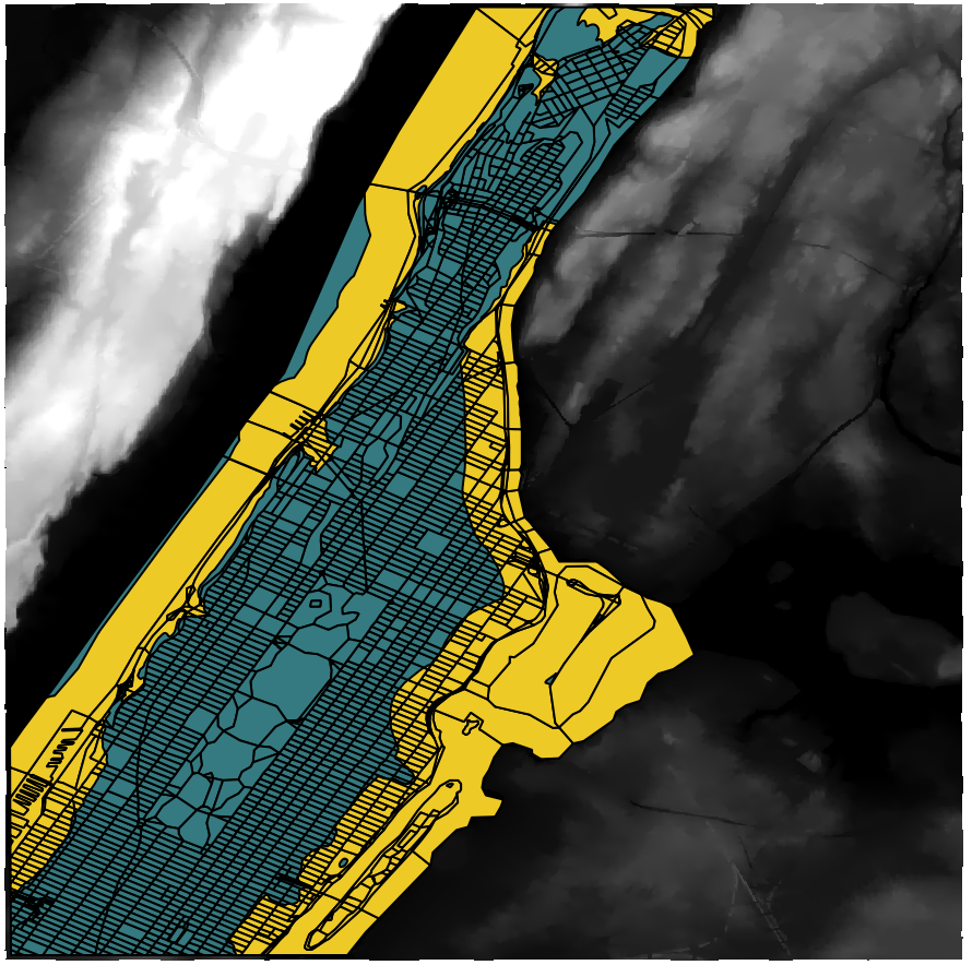
And there we have it. The orange area is the Vulnerable Area. If we look at the attribute table of this layer, we can analyze the characteristics of the vulnerable population, according to the attributes that already existed in the original Census Blocks layer, that is: Population, Age, Race and Gender.
More resources
I hope you have enjoyed this brief QGIS exercise and that this has helped you understand a bit better how GIS works and some of the things you can do with these applications. But don’t stop here! There’s much more to learn and there are plenty of resources online to help you learn more about QGIS. The first stop for you would be the GIS Practicum developed by Frank Donnelly of Baruch College. Also, don’t forget to check out the Raster Tutorial which will elaborate on alternatives ways of using Digital Elevation Maps and useful plugins. The GIS Lounge also has plenty of resources to learn GIS for free.
Remember that you can download many Shapefiles and Raster Images for free online, that you could find by doing Google searches or looking in specific sites, such as the NY State Data site, the US Census Bureau, or these recommendations from GIS Geography.
Last, but not least… if you’re interested in GIS and Mapping and would like to be in touch with others who are actively using GIS for their research or teaching, join us in the GIS / Mapping Working Group!
This is all for now. Stay tuned for more awesome tutorials by your friendly neighborhood Digital Fellows. Enjoy your newly acquired skills and put them to good use. Map the world!


