This is the third in a series of lessons on using the Bootstrap web framework to develop a WordPress theme.
In the first lesson, we started to get a feel for what Bootstrap looks like in a web browser and began to think about using Bootstrap code snippets to lay out a website.
In the second lesson, we incorporated the Bootstrap framework into a basic WordPress theme template and added some Bootstrap components to the WordPress site.
For this lesson, we will generate our own customized version of Bootstrap with modified colors, styles, etc., add it to our WordPress theme, and then incorporate Bootstrap into the site’s header.
Customizing Bootstrap
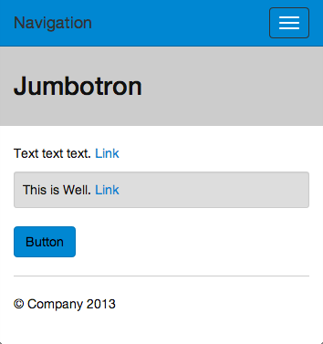
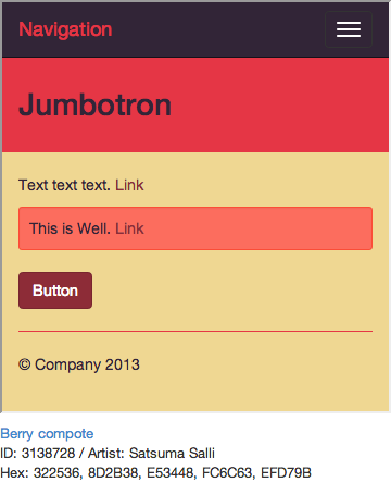
One of the neat things about Bootstrap is that its CSS styles are generated from compiled LESS code. What this means is that it uses variables to store information such as a color palette, relative font sizes and styles, and spacing rules. When you make a change to a single variable definition, that change will be propagated throughout the Bootstrap CSS automatically. So if you don’t like the default shade of blue that Bootstrap ships with, you can choose a different shade of blue and then everything that was the original blue will now be styled with your new shade of blue.


There are a number of ways to generate a custom build of Bootstrap. We’ll cover a few of them.
- The official Bootstrap website has a built-in customization page where you can manually set all of the different variables before downloading the Bootstrap package.
- Bootstrap Magic is a graphical/WYSIWYG version of the official Bootstrap customizer. It lets you preview your customizations as you edit them. Highly recommended. When you finish customizing, you can download the .css file, put it into your WordPress theme folder and change the
wp_enqueue_style()to point to your custom Bootstrap CSS instead of the default one (refer back to the previous lesson in this series if you aren’t sure about how to do this). The other thing you can do—this is a little more involved—is to download the “.less” file that is generated, place it in your Bootstrap “less” directory, and either rename it “variables.less” or modify bootstrap.less to include your customized magic-variables.less file instead of the default variables.less. The specifics of this process are beyond this lesson, but you can find plenty of assistance on Google. - Paintstrap is a less-involved tool that generates Bootstrap variables/CSS files for you based on a color palette you find or generate on ColourLovers or Adobe kuler. While very straightforward, Paintstrap’s only really useful for customizing your color scheme, but doesn’t help with the rest of your customizations like fonts, spacing, etc. What you can do, however, is to download the variables.less file that it generates and import it into Bootstrap Magic to finish your customization.
- Bootswatch has complete themes that you can download, with customizations throughout the Bootstrap interface system. If you’re looking for something slightly different from the default Bootstrap look with minimum fuss, this is definitely the place to start looking.
Once you have used one of the above tools to generate either a custom Bootstrap CSS or LESS file, you’ll want to make sure that you are using this custom version in your WordPress theme instead of the default version of bootstrap.css.
If you used methods 1, 2, or 4 above, the only thing you need to do is to copy the generated CSS file into your WordPress theme directory. Replace the default bootstrap.css file at [theme directory]/bootstrap/bootstrap.css with the one you generated, renaming it if needed.
If you used method 3 above, or method 2 and you downloaded the .less variables file, you can place the variables.less file into the LESS directory within your Bootstrap directory. You will then need to use a program such as Koala or LESS.app to convert the LESS files into CSS code. I won’t go through all of the details of this process, but basically, you set the LESS directory as the input directory in whichever program you use, then set the CSS directory as the output directory. Make sure that your variables.less file is included in the bootstrap.less file (you’ll need to open it in a text editor to check), and then run bootstrap.less through the LESS compiler to generate a custom bootstrap.css file.
Finally, you might also consider using one of the WP-LESS WordPress plugins (directions here or an alternative version in the WP plugin repository here) that allow you to directly include your LESS files in your WordPress theme like you would CSS files. The great thing about doing things this way is that you can add options to your theme that modify your LESS styles (see the first linked above).
Now that you have your own customized version of Bootstrap integrated into your WordPress theme, the last thing we’ll cover is integrating Bootstrap into your WordPress theme header.
Bootstrapping The WordPress Header
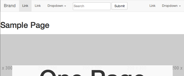
Starting with the base theme we modified in the last lesson, we will be modifying the header.php file to incorporate the Bootstrap navbar component, which will generate something that looks like this:

Step 1: Open “header.php” in your text editor. Notice the bit around line 24 that says <header id="masthead" class="site-header" role="banner">? We’re going to start our edits right below that. But first, delete lines 25-34, which contain the original header that we’re about to replace.
Step 2: Copy-paste the following chunk of code at line 25, right below the “header” tag (this code is taken directly from the example on the Bootstrap website):
<nav class="navbar navbar-default">
  <!-- Brand and toggle get grouped for better mobile display -->
  <div class="navbar-header">
    <button type="button" class="navbar-toggle">
      <span class="sr-only">Toggle navigation</span>
      <span class="icon-bar"></span>
      <span class="icon-bar"></span>
      <span class="icon-bar"></span>
    </button>
    <a class="navbar-brand" href="#">Brand</a>
  </div>

  <!-- Collect the nav links, forms, and other content for toggling -->
  <div class="collapse navbar-collapse" id="bs-example-navbar-collapse-1">
    <ul class="nav navbar-nav">
      <li class="active"><a href="#">Link</a></li>
      <li><a href="#">Link</a></li>
      <li class="dropdown">
        <a href="#" class="dropdown-toggle">Dropdown <b class="caret"></b></a>
        <ul class="dropdown-menu">
          <li><a href="#">Action</a></li>
          <li><a href="#">Another action</a></li>
          <li><a href="#">Something else here</a></li>
          <li class="divider"></li>
          <li><a href="#">Separated link</a></li>
          <li class="divider"></li>
          <li><a href="#">One more separated link</a></li>
        </ul>
      </li>
    </ul>
    <form class="navbar-form navbar-left">
      <div class="form-group">

      </div>
      <button type="submit" class="btn btn-default">Submit</button>
    </form>
    <ul class="nav navbar-nav navbar-right">
      <li><a href="#">Link</a></li>
      <li class="dropdown">
        <a href="#" class="dropdown-toggle">Dropdown <b class="caret"></b></a>
        <ul class="dropdown-menu">
          <li><a href="#">Action</a></li>
          <li><a href="#">Another action</a></li>
          <li><a href="#">Something else here</a></li>
          <li class="divider"></li>
          <li><a href="#">Separated link</a></li>
        </ul>
      </li>
    </ul>
  </div><!-- /.navbar-collapse -->
</nav>
Step 3: Edit the first line where it says <nav class="navbar navbar-default" role="navigation"> add the class “navbar-fixed-top” (I also suggest trying “navbar-static-top” to see how they differ). You should end up with a line that looks like: <nav class="navbar navbar-default navbar-fixed-top" role="navigation" style="top: 28px;">
The “navbar-fixed-top” class styles the navbar so that it sticks to the top of the page, while the little bit that says “top: 28px” moves it down just enough so that it is not covered by the WordPress top bar thing. If you use the “static” navbar instead, you’ll notice that it scrolls with the page instead of remaining visible as you scroll. If you prefer the static navbar, you will want to remove the ‘style=”top: 28px”‘ bit.
Step 4: Save the file and load your theme in a browser (refer to the previous lesson if you’re unsure about this). You should see a generic looking navigation bar at the top of the page, and when you scroll it should “stick” to the top:

If you’re not seeing this, double check that your theme is correctly including the bootstrap.css file. You should also check to see if the page contains errors that might be preventing something from working. You can do this using the developer tools built in to most browsers (Google is your friend in this…).
Step 5: Edit the line that says: <a class="navbar-brand" href="#">Brand</a> and replace “Brand” with <?php bloginfo( 'name' ); ?> and replace the “#” with <?php echo esc_url( home_url( '/' ) ); ?> so that you end up with a line that looks like: <a class="navbar-brand" href="<?php echo esc_url( home_url( '/' ) ); ?>"><?php bloginfo( 'name' ); ?></a>
What this does is call the WordPress function “bloginfo(’name’)”, which displays the title of your blog, in this case, within the navbar. It also uses the “home_url()” function to link the blog name to the homepage URL.
We’re now well on our way to a working header navigation bar, but the next step of adding the WordPress menus will take a few additional steps…
Add WordPress Menus to The Bootstrap Navbar
Step 1: WordPress uses a system called a “navwalker” to generate its menus. In order to get the menus to work with the Bootstrap navbar, we need to add a custom navwalker that will override the built in WordPress system. There are several ready-to-use navwalkers on Github that are compatible with Bootstrap 3.0, but we’re going to use the version developed by Github user twittem here. There are some other forks of this navwalker with additional functionality, such as this one that supports multi-level dropdown menus and this one that adds the blog description to the navbar.
Download the wp-bootstrap-navwalker zip from one of the above Github repositories, unzip it, and copy “wp_bootstrap_navwalker.php” to your theme directory.
Step 2: Edit your “functions.php” file to include wp_bootstrap_navwalker.php by adding the following lines:
// Register Custom Navigation Walker
require_once('wp_bootstrap_navwalker.php’);
Step 3: Edit “header.php” to use the new navwalker instead of the default navigation links.
Delete everything between <!-- Collect the nav links, forms, and other content for toggling --> and <!-- /.navbar-collapse -->.
In its place, copy-paste the following:
<div class="collapse navbar-collapse" id="bs-example-navbar-collapse-1">
      'primary',
           'theme_location'    => 'primary',
           'depth'             => 2,
           'menu_class'        => 'nav navbar-nav',
           'fallback_cb'       => 'wp_bootstrap_navwalker::fallback',
           'walker'            => new wp_bootstrap_navwalker())
       );
     ?><!-- /.navbar-collapse -->
</div>
What this does is create a new navigation menu using the built-in WordPress function “wp_nav_menu()”, which in turn calls the wp_bootstrap_navwalker function that we just added in the previous step. The options that are being passed to “wp_nav_menu()” are described in the WordPress codex, so check that out for more information.
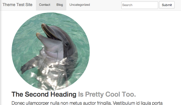
Step 4: Test it out. When you load your WordPress site in a browser, you should see the navbar at the top, with the blog title on the left and either your primary navigation menu or “Add a menu” displayed if you haven’t set the menu yet. In the latter case, set up a menu by clicking the link. Be sure to check the box at the bottom of the menu customization area to display the menu in the Primary menu area.
If everything went as planned, you should see something like this:

Step 5: You can optionally add a search form to the navigation menu by adding the following code right before the closing </div> tag in the previous step:
<form id="searchform" class="navbar-form navbar-right" method="get" action="/" role="search">
If everything went as planned, you should see a navbar menu like the one shown at the beginning of this section.
Note that when you resize the browser window to make it really narrow, the menu, including the search form, should disappear into a little button that you can click to display the menu again. Neat, right? That’s the magic of Bootstrap.
Next Steps
This covers the basics of getting Bootstrap integrated into your WordPress theme. There are a ton of things that you can do from here to continue adding Bootstrap components throughout the rest of the theme. For example, you could create a contact form, login dialog, photo galleries, carousels, etc., all using components that are built-in to Bootstrap. Be sure to check out the official Bootstrap documentation for a complete list of components, CSS, and javascript/jQuery that you can use throughout your WordPress theme.
A good next step is to use Bootstrap to modify your theme’s “footer.php” to make a page footer to match the header navbar we put together in this lesson.
You also probably want to add some Bootstrap classes to all of the page/content templates, including index.php, page.php, content.php, archive.php, sidebar.php, single.php, and search.php. In order to Bootstrap your page layout, you want to first modify page.php since that is the default base template. You can use various numbers of columns to set the layout of the main content area and sidebars. All of this is beyond the scope of this brief set of lessons, but there are plenty of resources on the web to help you along. Here are a few:
- http://bootstraphero.com/the-big-badass-list-of-twitter-bootstrap-resources
- http://tutorialzine.com/2013/07/50-must-have-plugins-for-extending-twitter-bootstrap/
- http://bootsnipp.com/resources
- http://wordpress.org/plugins/easy-bootstrap-shortcodes/
- http://wordpress.org/plugins/bootstrap-shortcodes/
- http://www.hongkiat.com/blog/twitter-bootstrap/
That’s it for now. If you have questions or thoughts on this series of lessons, don’t hesitate to leave a comment.
Learn Bootstrap and Integrate it into WordPress
This three-part series covers the basics of working with the Bootstrap web framework and integrating it into a WordPress theme.
- Lesson 1: Getting familiar with Bootstrap
- Lesson 2: Adding Bootstrap to a WordPress theme
- Lesson 3: Customizing Bootstrap and Adding it to the WordPress Header


